18 Best Fonts For Websites To Improve Readability And Design
Choosing the best fonts for websites can improve readability, strengthen brand identity, and create a more professional online presence. Typography influences how visitors read, understand, and interact with your content.
The right fonts make your website easier to navigate while helping your content feel welcoming and trustworthy. They also create visual consistency across headings, paragraphs, menus, and other design elements.
Whether you manage a business website, blog, online store, or portfolio, choosing suitable typography can improve the visitor experience. Font style, size, spacing, and readability all contribute to effective website design.
In this guide, we’ll explore 18 of the best fonts for websites and seven practical strategies for choosing typography that complements your brand and supports your website’s goals.
Exploring The 18 Best Fonts For Websites
The best fonts for websites combine readability, visual appeal, and consistency. Different typefaces suit different purposes, from professional business websites to creative portfolios and personal blogs.
The following 18 fonts offer a variety of styles for modern website design. Understanding their characteristics can help you choose typography that complements your brand and improves the reading experience.
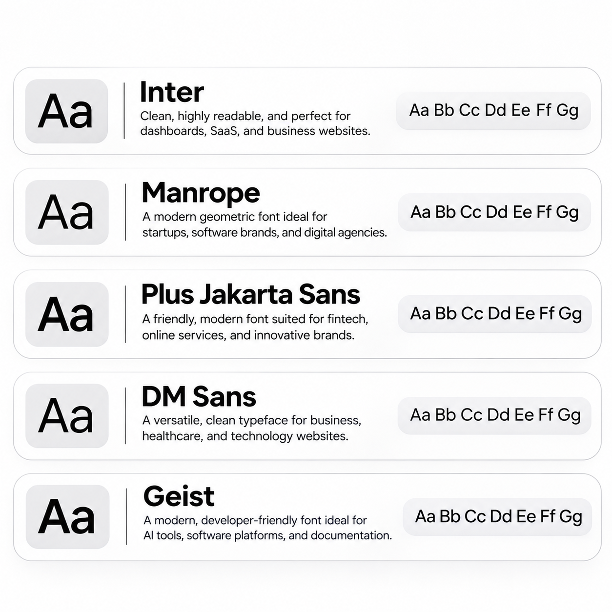
1. Inter
Inter is an excellent modern choice for professional website typography. Its clean letterforms and balanced spacing make text comfortable to read across different screen sizes.
It works particularly well for dashboards, pricing tables, product descriptions, and navigation menus. Technology companies and SaaS businesses can use it to create polished, organized interfaces.
Inter offers several font weights for distinguishing headings and content sections. Our guide to user-friendly blog design explains how these design choices improve the visitor experience.
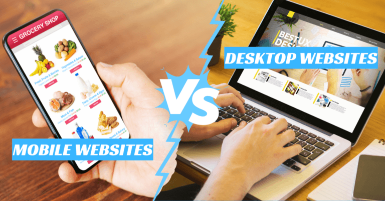
Its adaptable appearance also makes Inter suitable for responsive layouts. Our comparison of mobile websites vs desktop websites explores the importance of designing for different devices.
Inter is especially valuable when consistency, readability, and contemporary styling matter. It suits both content-heavy websites and modern digital applications.
2. Manrope
Manrope is a contemporary geometric sans-serif font with a clean, sophisticated appearance. Its balanced proportions give headings personality while keeping supporting text readable.
Startups, software companies, and digital agencies can use Manrope to establish a modern identity. Our guide to brand positioning examples explores how businesses communicate their distinctive qualities.
The font offers multiple weights for headings, navigation menus, and body text. This flexibility helps designers maintain visual consistency without making pages overly decorative.
Manrope also works well on landing pages that need clear, professional typography. Our guide on how to create a landing page in Wix explores practical page design considerations.
Its combination of simplicity and character makes Manrope appealing to modern businesses. It provides visual personality without sacrificing readability.
3. Plus Jakarta Sans
Plus Jakarta Sans offers a modern appearance with warmer, friendlier letterforms than many traditional interface fonts. It helps businesses appear innovative while remaining approachable.
Fintech platforms, startups, and consumer-focused applications can benefit from its balanced design. The typeface communicates professionalism without feeling overly formal.
Its flexible styling supports consistent headings, navigation menus, and supporting content. Our article on examples of personal branding explores how visual consistency strengthens professional identity.
Plus Jakarta Sans also suits marketing pages that need to communicate confidence and warmth. Our guide to building a landing page for free explains how to create pages with clear visual presentation.
Its friendly character makes Plus Jakarta Sans a valuable option for contemporary websites. It combines an inviting appearance with practical readability.
4. DM Sans
DM Sans is a versatile modern typeface designed for clear digital communication. Its balanced letterforms work well in headings, smaller interface text, and everyday website content.
Businesses can use it to organize service information, pricing details, and product benefits. Our guide on creating a business website explores other elements of professional website design.
DM Sans also suits healthcare and technology brands seeking an approachable visual identity. Its understated appearance allows images, colours, and other design elements to stand out.
Its variable font capabilities provide flexibility when adjusting text weights. Designers can create a consistent hierarchy across headings, menus, and body paragraphs.
DM Sans works particularly well on clean, organized landing pages. Our guide on how to create a landing page in Squarespace explores another platform for presenting information professionally.
This typeface offers attractive typography without unnecessary visual complexity. It is especially useful for websites that prioritize clarity and simplicity.
5. Geist
Geist is a modern typeface family developed for digital interfaces and developer-focused products. Its precise letterforms create a technical yet approachable appearance.
It is particularly suitable for AI tools, software platforms, and developer documentation. Technology companies can use it to maintain a consistent identity across their digital products.
Geist works well for navigation menus, interface labels, and informational sections. Our guide to creating a one-page website explores how streamlined layouts can present essential information effectively.
Its clean structure supports readability while maintaining a contemporary technical style. This makes it useful for businesses that value simplicity and functionality.
Geist can also complement other visual design elements. Our article on free computer graphic design software explores creative tools for developing digital graphics and website visuals.
For companies building modern digital products, Geist offers a polished and functional appearance. It communicates innovation without overwhelming the website’s content.
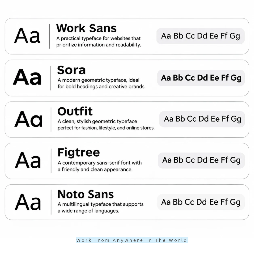
6. Work Sans
Work Sans is a practical typeface for websites that prioritize information and readability. Its straightforward letterforms make it suitable for articles, service descriptions, and business content.
Unlike decorative fonts, Work Sans maintains a balanced appearance across different text sizes. This makes it useful for publishers who regularly create high-quality blog posts.
Content creators can use it for headings, navigation menus, and paragraphs without introducing visual distractions. Its clean design helps readers concentrate on the information being presented.
Work Sans also suits corporate websites that need a professional but approachable appearance. Its flexible weight options help establish a clear visual hierarchy across multiple pages.
For websites with extensive written content, our guide on how to make your content better explores additional ways to improve presentation and readability.
7. Sora
Sora is a contemporary geometric typeface with distinctive letterforms and a confident visual personality. Its modern appearance makes it particularly effective for large headings and brand-focused sections.
AI companies, technology startups, and digital agencies can use Sora to communicate innovation and creativity. Its distinctive styling helps important messages stand out.
Sora also works well on landing pages where the main heading needs immediate attention. Our guide to catchy blog post title ideas explores another way to create engaging headlines.
The font offers several weights for establishing different content levels. Designers can use heavier styles for headings while choosing lighter weights for supporting text.
For longer paragraphs, pairing Sora with a neutral body font such as Inter can improve reading comfort. Our guide to the best web fonts for your blog explores additional typography considerations.
8. Outfit
Outfit is a modern geometric sans-serif typeface with clean, rounded characteristics. Its stylish appearance suits brands that want to create a contemporary visual identity.
Fashion stores, lifestyle businesses, and creative agencies can use Outfit for headings and promotional content. Its distinctive letterforms help establish brand personality without elaborate decorative elements.
Outfit is especially effective in hero sections, promotional banners, and product categories. Our guide to the best Shopify themes for clothing brands explores related design choices for fashion retailers.
The font also works for supporting text when appropriate sizes and weights are selected. This flexibility makes it useful for maintaining consistent typography across commercial websites.
For online retailers, attractive typography should complement clear navigation and product information. Our article on eCommerce website best practices explores additional ways to improve the shopping experience.
9. Figtree
Figtree is a contemporary sans-serif font that combines a friendly appearance with a clean typographic structure. Its balanced design supports readability while maintaining a modern visual identity.
eCommerce businesses can use Figtree for product titles, descriptions, and navigation menus. Its approachable character helps create a welcoming shopping environment.
Our guide to content strategies for eCommerce blogs explores how retailers can present useful information alongside their products.
Educational platforms and service providers can also benefit from Figtree’s friendly appearance. Its different weights allow headings to stand out while keeping supporting text readable.
For educational websites, clear typography can make lessons and resources easier to navigate. Our article on digital education tools explores platforms that support modern learning experiences.
Figtree is particularly useful for brands seeking a modern alternative to familiar sans-serif fonts. It offers a distinctive appearance without making website content difficult to read.
10. Noto Sans
Noto Sans is especially valuable for websites publishing content in multiple languages. Google’s Noto project supports a broad range of writing systems and helps maintain consistent typography.
International businesses, educational platforms, and information portals can benefit from its extensive language coverage. Its clean letterforms also suit general website content and navigation menus.
For multilingual publishers, typography is only one part of communicating effectively. Our guide on blogging for non-native English speakers explores additional challenges faced by international content creators.
Website owners should select the appropriate language-specific Noto font files to ensure proper character coverage. Not every Noto Sans file supports every writing system.
Noto Sans can also complement multilingual website tools and translation services. Our Lingotek Translation review explores a solution for managing translated website content.
Its extensive language support makes Noto Sans a practical choice for international websites. It helps maintain a consistent appearance while accommodating different writing systems.
11. Source Sans 3
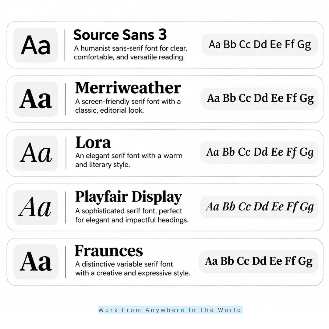
Source Sans 3 is designed for clear communication across digital interfaces and content-heavy websites. Its humanist letterforms create a natural appearance that supports comfortable reading.
Educational websites, technical documentation platforms, and professional publications can benefit from its practical design. It also works well for navigation menus, article paragraphs, and structured informational pages.
Source Sans 3 is particularly useful for publishers creating detailed guides and tutorials. Our WordPress tutorial for beginners explores the type of educational content that benefits from clear typography.
Its flexible styling helps distinguish headings, instructions, and supporting information. This makes longer articles easier to navigate without introducing unnecessary visual distractions.
Website owners can also combine readable typography with effective content organization. Our guide to writing SEO-friendly content explores ways to make online information more accessible and useful.
Source Sans 3 offers an excellent balance between functionality and visual simplicity. Its approachable appearance makes it suitable for professional websites and educational resources.
12. Merriweather
Merriweather is a screen-oriented serif typeface with a traditional editorial character. Its distinctive letterforms and serif details make it suitable for websites publishing substantial written content.
Online magazines, educational publications, and professional blogs can use Merriweather to create an inviting reading environment. Its established appearance gives editorial content a refined, professional feel.
Publishers who produce detailed articles may appreciate its comfortable reading experience. Our guide to writing articles for magazines explores another aspect of creating engaging editorial content.
Merriweather also pairs effectively with modern sans-serif fonts for navigation and interface elements. This combination creates visual contrast while keeping the overall website design consistent.
Its traditional styling works particularly well for informative articles and thoughtful commentary. Our guide to the secrets of an awesome blog post explores additional ways to engage readers.
Merriweather is an excellent choice for publishers seeking a credible, editorially refined appearance. It combines classic typography with practical readability on digital screens.
13. Lora
Lora combines traditional serif characteristics with a contemporary visual style. Its elegant curves and balanced letterforms give websites a warm, literary appearance.
Lifestyle publishers, travel bloggers, and personal websites can use Lora to create distinctive headings. Its inviting style also complements articles that emphasize storytelling and personal experiences.
For travel publishers, typography can help establish a memorable editorial identity. Our guide to making money travel blogging explores opportunities for building a travel-focused website.
Lora is particularly effective when a brand wants to communicate creativity, personality, and sophistication. Its distinctive appearance adds character without requiring elaborate decorative elements.
It also pairs well with sans-serif fonts such as Inter or DM Sans. This creates a clear distinction between editorial content and navigation menus.
Writers who enjoy expressive content may also appreciate our creative writing tips for students. These techniques can complement the welcoming presentation that Lora brings to a website.
Its versatility makes Lora an attractive choice for content-focused websites. It offers an elegant appearance while supporting comfortable reading across different types of articles.
Wealthy Affiliate – Mini Review
If you’ve ever thought about turning your blog, passion, or niche into an online business,
Wealthy Affiliate (WA) is one of the most beginner-friendly platforms I’ve used.
It combines step-by-step training, website hosting, AI-powered tools,
keyword research, and an active community all in one place.
What I like most is that you can start for free (no credit card needed), explore the platform,
test the tools, and connect with other entrepreneurs before upgrading.
WA isn’t a “get rich quick” scheme — success comes from consistent effort
and applying what you learn over time.
14. Playfair Display
Playfair Display is an expressive serif typeface known for its elegant letterforms. Its strong contrast between thick and thin strokes creates a sophisticated appearance.
It is particularly effective for large headings that need visual distinction. Luxury businesses, fashion brands, and editorial publications can use it to strengthen their brand identity.
Beauty websites can also benefit from its refined appearance and memorable headlines. Our guide on how to start a beauty blog explores building a website around this popular niche.
Playfair Display works especially well in hero sections and promotional banners. Its distinctive styling helps important messages attract attention without requiring elaborate decorative elements.
For body text, pair it with a clean sans-serif font such as Lato or Inter. This combination creates visual contrast while maintaining comfortable reading throughout the website.
Typography also contributes to the overall presentation of an online fashion store. Our guide to Shopify themes for clothing brands explores other design choices that complement a distinctive visual identity.
Use Playfair Display selectively for important headings and featured content. Its elegant character works best when balanced with simpler typography.
15. Fraunces
Fraunces is a distinctive variable serif typeface with a creative and expressive personality. Its unusual letterforms help websites establish a memorable visual identity.
The font includes adjustable characteristics that allow designers to explore different styles. These options provide flexibility when creating headlines, promotional sections, and branded content.
Creative studios and premium lifestyle businesses can use Fraunces to communicate originality. Our guide on how to be more creative explores ways to develop fresh ideas and creative thinking.
Fraunces is particularly effective in large display text, where its distinctive shapes stand out. Food brands and editorial websites can use it to create engaging headlines.
For food-focused publishers, typography can complement photography and storytelling. Our article on how to make money on a food blog explores opportunities for developing a food-related website.
Pairing Fraunces with a neutral sans-serif font such as Inter helps maintain readability. This combination allows expressive headings to stand out while keeping longer paragraphs comfortable to read.
Fraunces is an excellent choice for brands seeking distinctive typography without sacrificing functionality. Its flexibility supports creative website designs with a consistent visual identity.
16. Roboto
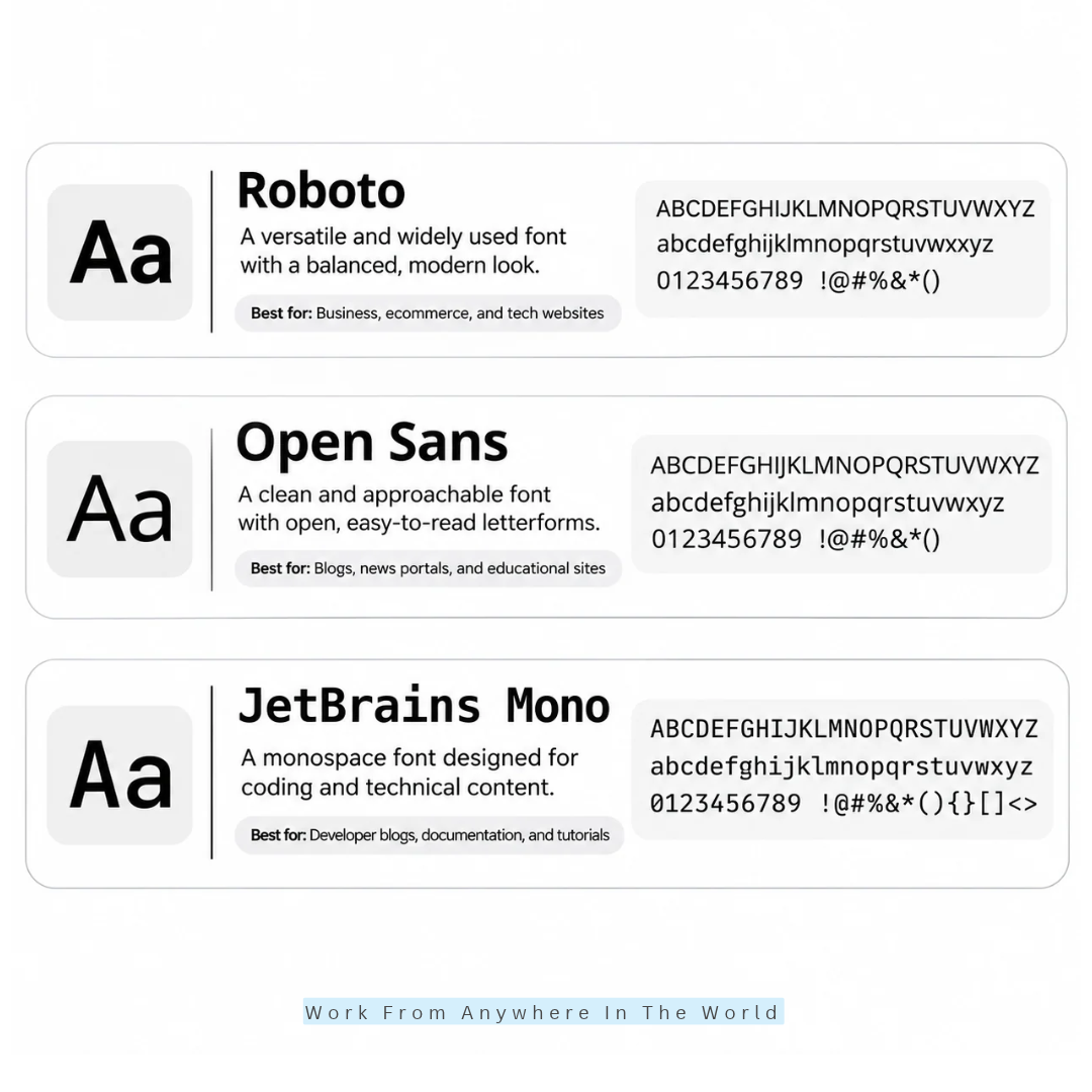
Roboto remains a widely used and practical typeface for modern digital products. Its balanced letterforms combine a structured appearance with friendly curves.
Corporate websites, eCommerce platforms, and mobile applications can use Roboto for headings and body content. Its familiar appearance supports a consistent experience across different devices.
The font offers several weights for navigation menus, buttons, and informational sections. This flexibility helps designers create a clear hierarchy without introducing unnecessary visual distractions.
Roboto also suits online stores that need organized product information. Our guide to WordPress eCommerce plugins explores tools for building and managing online stores.
Its balanced structure makes Roboto useful for responsive websites. Clear typography helps visitors navigate content on both desktop and mobile screens.
Website performance also contributes to a comfortable browsing experience. Our guide to improving website speed explores practical ways to improve loading performance.
Roboto is a dependable choice for businesses seeking familiar, functional typography. Its versatility makes it suitable for professional websites and digital applications.
17. Open Sans
Open Sans is a versatile typeface recognized for its open letterforms and approachable appearance. Its balanced design supports comfortable reading across different website sections.
Educational platforms, business blogs, and news portals can use Open Sans for headings and paragraphs. Its neutral styling keeps the focus on information rather than decorative elements.
For educational publishers, readable typography helps visitors follow lessons and instructions. Our guide to popular online learning platforms explores digital environments where clear communication matters.
Open Sans also works well for professional service providers publishing detailed information. Its multiple weights help establish a consistent hierarchy across headings, menus, and supporting text.
Designers can pair it with expressive heading fonts such as Playfair Display or Montserrat. This combination creates visual contrast while keeping longer paragraphs easy to read.
Typography also supports effective content presentation. Our guide to writing high-quality blog posts explores additional ways to make written information useful and engaging.
Open Sans remains a dependable option for websites that prioritize clarity. Its practical appearance suits both educational resources and professional publications.
18. JetBrains Mono
JetBrains Mono is a monospace typeface designed specifically for coding environments and technical content. Every character occupies the same horizontal width, making programming examples easier to align.
Developer blogs, software documentation, and coding tutorials can use it for code blocks. Its distinctive letterforms also help readers distinguish similar-looking characters and symbols.
JetBrains Mono works particularly well for terminal commands and programming instructions. Its consistent spacing helps preserve the formatting needed for technical examples.
Website owners publishing technical tutorials may combine it with other readable fonts. Our WordPress tutorial for beginners demonstrates the importance of presenting instructions in an organized format.
Although JetBrains Mono is useful for code, it is less suitable for general website paragraphs. Pairing it with Inter or Roboto creates a balanced typography system for developer-focused websites.
This combination allows technical examples to stand out without overwhelming the surrounding content. Our guide on how to use WordPress explores another area where clear instructions support learning.
JetBrains Mono is an excellent choice for websites featuring programming and technical resources. Its specialized design improves code presentation while complementing more conventional body fonts.
7 Essential Strategies For Choosing The Best Fonts For Your Website
Choosing the best fonts for websites involves more than finding an attractive typeface. Your decision should reflect your brand identity, audience expectations, content requirements, and technical needs.
These seven strategies will help you create a consistent typography system. They also make it easier to balance visual appeal, readability, and website performance.
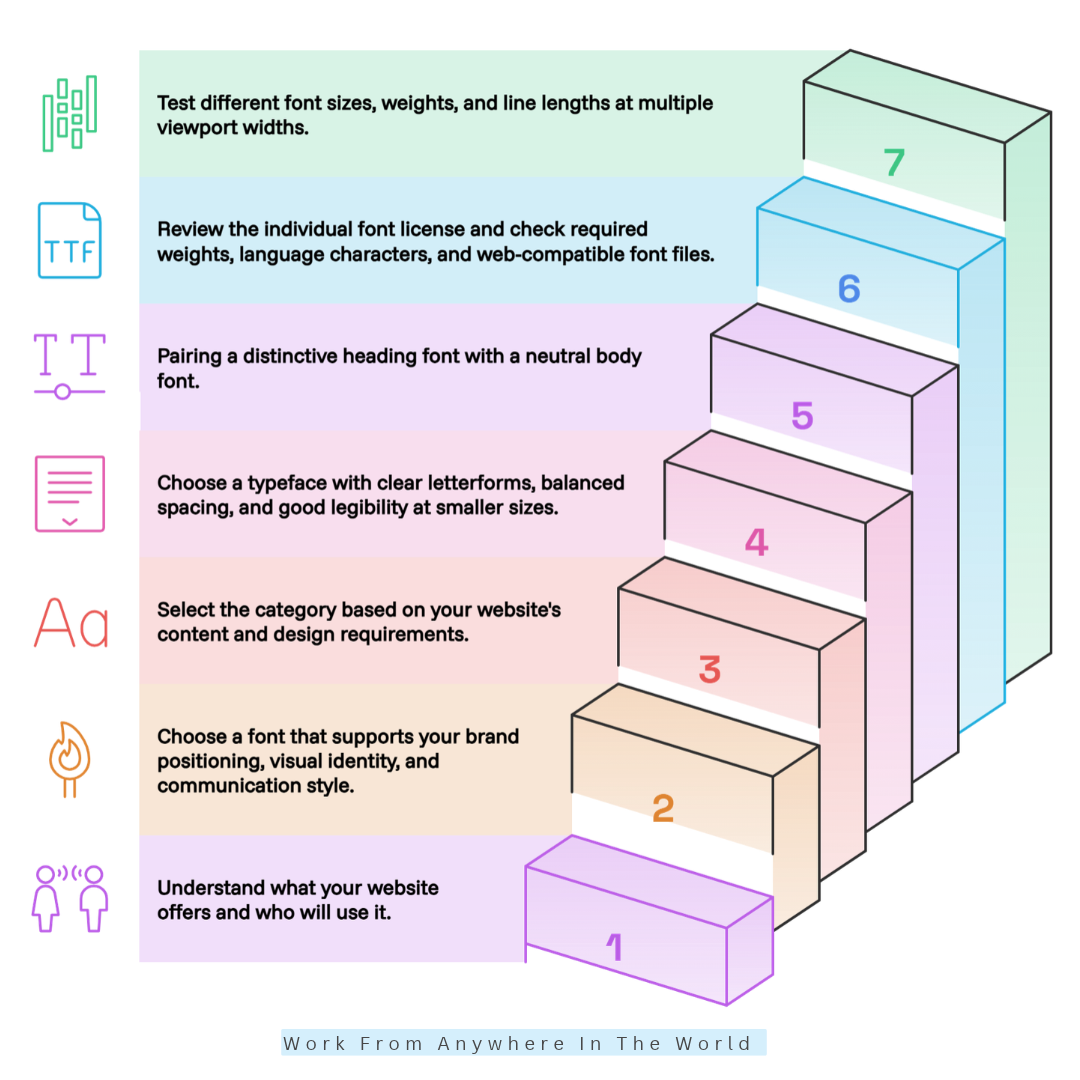
1. Identify Your Website’s Purpose And Target Audience
Start by understanding what your website offers and who will use it. A technology platform needs functional typography, while a luxury fashion website may benefit from elegant serif fonts.
Consider your visitors’ expectations, reading habits, and preferred devices. Inter works well for SaaS platforms, while Playfair Display creates a sophisticated appearance for premium brands.
For example, a nature-focused website such as Close To Nature benefits from welcoming typography that complements its gardening, wildlife, and wellness content.
Understanding your audience helps you choose fonts that support your message. The goal is to make visitors feel comfortable while exploring your website.
2. Match Font Personality With Your Brand Identity
Typography communicates your brand personality before visitors explore your content. Geometric fonts such as Manrope and Plus Jakarta Sans create a contemporary impression, while Fraunces offers creativity and elegance.
Choose fonts that support your visual identity and communication style. Our guide to brand positioning examples explains how businesses develop a recognizable identity.
A lifestyle website such as Living The Vegan Lifestyle can use friendly typography to complement recipes, nutrition guides, and plant-based living articles.
Consistent typography across landing pages, product sections, and promotional materials strengthens recognition. It also helps visitors experience your website as one cohesive brand.
3. Choose The Right Font Category
Understanding font categories helps narrow your choices and establish a suitable visual direction. Sans-serif fonts suit modern interfaces, while serif fonts create a more traditional editorial appearance.
Display fonts add personality to prominent headings and promotional sections. Monospace fonts are particularly useful for programming examples and technical documentation.
A holistic pet wellness website such as PawReiki may benefit from gentle, approachable typography. Its design can reflect the calming nature of its animal wellness content.
Choose font categories based on your website’s purpose rather than popularity alone. Our guide to web fonts for your blog explores additional typography options.
4. Prioritize Readability For Website Body Text
Body typography influences how comfortably visitors read your content. Choose clear letterforms, balanced spacing, and good legibility across different screen sizes.
Inter, Open Sans, and Source Sans 3 are useful choices for information-rich websites. They provide clean typography without distracting readers from the main message.
A body font size of approximately 16–18px is a practical starting point. Line heights between 1.5 and 1.7 can also support comfortable reading.
However, font size and spacing should suit your chosen typeface and audience. Our guide to user-friendly blog design explores other ways to improve the reading experience.
5. Select Complementary Fonts For Headings And Paragraphs
A carefully selected font combination creates contrast without making your website look inconsistent. Consider pairing an expressive heading font with a neutral body font.
For example, Playfair Display with Inter creates an elegant editorial appearance. Montserrat with Open Sans offers a clean combination for modern business websites.
Two complementary font families are usually sufficient for a professional website. Use different weights and sizes to distinguish headings, paragraphs, buttons, and navigation menus.
Consistent font combinations also support a recognizable visual identity. Avoid introducing additional typefaces unless they serve a clear design purpose.
6. Check Font Licensing And Availability
Font licensing matters when creating commercial websites or working on client projects. Always review the terms before downloading, embedding, or redistributing a typeface.
Google Fonts offers many open-source fonts for personal and commercial projects. Adobe Fonts and Fontshare provide additional options under their respective licensing terms.
Check whether the required font weights, language characters, and web-compatible files are available. Some typefaces offer extensive language coverage, while others support fewer writing systems.
Review each font’s individual license rather than assuming all platforms follow identical rules. This helps avoid licensing problems as your website grows.
7. Evaluate Mobile Responsiveness And Loading Performance
Your selected fonts should remain readable on desktop computers, tablets, and smartphones. Test different sizes, weights, and line lengths across multiple screen widths.
Large font files and unnecessary weights can increase loading times. Our guide to improving website speed explores other ways to improve website performance.
Consider optimized WOFF2 files, variable fonts, and appropriate fallback typefaces. Selective preloading can also help when applied to critical fonts.
Load only the font families and weights your design actually requires. This reduces unnecessary downloads while maintaining a consistent appearance across devices.
Finally, test your typography on real screens whenever possible. A font that looks attractive on a desktop monitor may need adjustments for smaller devices.
Frequently Asked Questions
Q1: How Many Fonts Should A Website Use?
Most websites can achieve a consistent design using one or two font families. One font for headings and another for body text can create a clear visual hierarchy.
Using too many fonts can make a website appear cluttered. Choose complementary styles that support your brand identity and remain readable.
Q2: Do Website Fonts Affect SEO?
Fonts are not direct Google ranking factors. However, readable typography and responsive layouts can improve the visitor experience.
Efficient font loading can also support website performance and Core Web Vitals. These technical considerations are important for creating a fast, accessible website.
Q3: Can I Use Two Different Fonts On My Website?
Yes, combining two complementary fonts can improve visual hierarchy. For example, Playfair Display works well for headings, while Inter suits body text.
Choose fonts with contrasting personalities but compatible proportions. This creates visual interest without making your website look inconsistent.
Q4: What Is The Ideal Font Size For Website Content?
A body text size of 16–18px is a practical starting point for many websites. Headings may range from 24–48px, depending on their importance.
Adjust font sizes for different devices and screen widths. Comfortable reading also depends on line spacing, contrast, and font design.
Q5: Which Fonts Are Best For Mobile Websites?
Inter, Roboto, Open Sans, and Source Sans 3 are practical choices for mobile websites. Their clear letterforms support readability on smaller screens.
However, font choice alone does not guarantee a mobile-friendly experience. Appropriate sizing, spacing, and responsive layouts are equally important.
Q6: Are Google Fonts Free For Commercial Websites?
Yes, Google Fonts provides open-source typefaces that can be used commercially under their respective licenses. Many are available under the SIL Open Font License.
Always review each font’s license before using or redistributing it. Check that your chosen font includes the weights and characters your website requires.
Conclusion
Choosing the best fonts for websites involves balancing readability, brand personality, and performance. Fonts such as Inter, Roboto, Open Sans, and Merriweather offer practical options for different website styles.
Your ideal font should complement your brand identity and meet your audience’s needs. Clear typography also makes your content easier to navigate and enjoy.
Thoughtful font combinations, responsive sizing, and optimized loading can improve the visitor experience. These choices help create a professional website that feels welcoming and accessible.
I trust you enjoyed this guide to the 18 Best Fonts for Websites to Improve Readability and Design. Please stay tuned for more helpful articles on affiliate marketing, online business, and working from anywhere in the world.
Take care!
— JeannetteZ 🌍✨
💬 Your Opinion Is Important To Me
Do you have thoughts, ideas, or questions? I’d love to hear from you. Please leave your comments below or email me directly at Jeannette@WorkFromAnywhereInTheWorld.com.
📚 More Work From Anywhere Reads
🚀 Ready to Build a Business You Can Run from Home
Or from Anywhere in the World?
Imagine earning income on your terms — from home, a cozy café, or wherever life takes you.
With the right tools, training, and community support, it’s entirely possible.
Start your own online business for free — no credit card needed.
Disclosure
This post may contain affiliate links. As an Amazon Associate and participant in other affiliate programs, I earn from qualifying purchases at no extra cost to you. Please read my full affiliate disclosure.