Mobile Websites vs Desktop Websites
The way we browse the internet has changed a lot over the years. There was a time when almost everything happened on desktop computers. Now, mobile devices are leading the charge.
Because of this shift, a big question keeps coming up for businesses, designers, and marketers: Mobile Websites vs Desktop Websites — which one should you prioritize? In this guide, we’ll break things down in a simple, practical way.
By understanding how people behave on each platform and how design and performance differ, you’ll be able to decide where your website needs the most attention.
Pros Of Mobile Websites
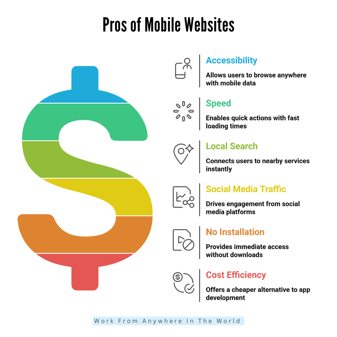
1. Highly Accessible Anywhere
Mobile websites are incredibly accessible because people always carry their phones. Whether someone is commuting, waiting in line, shopping, relaxing at home, or travelling, they can pull out their device and browse instantly.
There’s no need for a computer or Wi-Fi; mobile data makes access even easier. This constant availability means customers can reach your business at any moment. It also supports spontaneous browsing, which often leads to quick decisions.
Mobile websites meet users where they are. That convenience helps to seize our attention and stay relevant. Being available anytime creates more chances for engagement and stronger customer relationships daily.
2. Faster For Quick Actions
Mobile websites are ideal for quick actions because they’re designed to load fast and present information clearly. People use their phones when they want answers right away, not after a long wait.
When a mobile website is optimized, users can read, click, buy, or search within seconds. Small screens encourage simpler layouts, which help users find what they need quickly. This speed matters when someone is comparing prices, checking hours, or browsing while multitasking.
A fast mobile site supports instant decisions and prevents users from getting frustrated. Quick actions build trust, improve satisfaction, and boost overall engagement effortlessly and consistently.
3. Essential For Local Searches
Mobile websites are essential for local searches because most people search for nearby services on their phones. When someone types “restaurants near me” or “best plumber nearby,” mobile devices instantly connect them to local options.
This creates powerful opportunities for small businesses. A mobile-friendly website helps customers find directions, contact numbers, menus, or service details without hassle. It also improves visibility on Google, especially in map results.
Local searchers often have strong intent, meaning they’re ready to buy or visit soon. Mobile websites make those moments easy, helping businesses reach people at precisely the right time.
4. Great For Social Media Traffic
Mobile websites naturally get more clicks because mobile devices are used for the majority of social media browsing. When users see a post, ad, or story they like, they tap instantly and expect the site to open smoothly.
A mobile-friendly website keeps that flow going. It loads fast, displays clearly, and keeps people engaged after they leave the app. This is important because social media traffic is spontaneous. People don’t plan to visit a site—they just follow curiosity.
A good mobile website turns those quick taps into meaningful actions. It boosts engagement, builds trust, and helps social media campaigns perform better.
5. No Installation Needed
Mobile websites don’t require installation, which makes them incredibly convenient. Users don’t have to download an app, wait for it to install, or worry about storage space. They simply tap a link and access everything immediately.
This reduces friction and encourages more people to visit. Updates are automatic, so the website always displays the latest information without any effort from the user. It’s simple, fast, and accessible to everyone.
This matters because most users avoid downloading apps unless they plan to use them often. A mobile website gives your audience instant access with zero commitment, making interactions far easier.
6. Cheaper Than App Development
Creating a responsive mobile website is much cheaper than developing a complete mobile app. Apps require specialized coding, multiple versions for different platforms, regular updates, testing, and ongoing maintenance.
All of that increases costs. On the other hand, a mobile website can be created more quickly and easily by using regular web development tools.
It works across all devices automatically, without needing separate versions. It also avoids app store fees and lengthy approval processes.
For small businesses or startups, this cost efficiency is a significant advantage. You get broad reach, strong usability, and professional presence without the heavy financial investment apps usually require.

Cons Of Mobile Websites
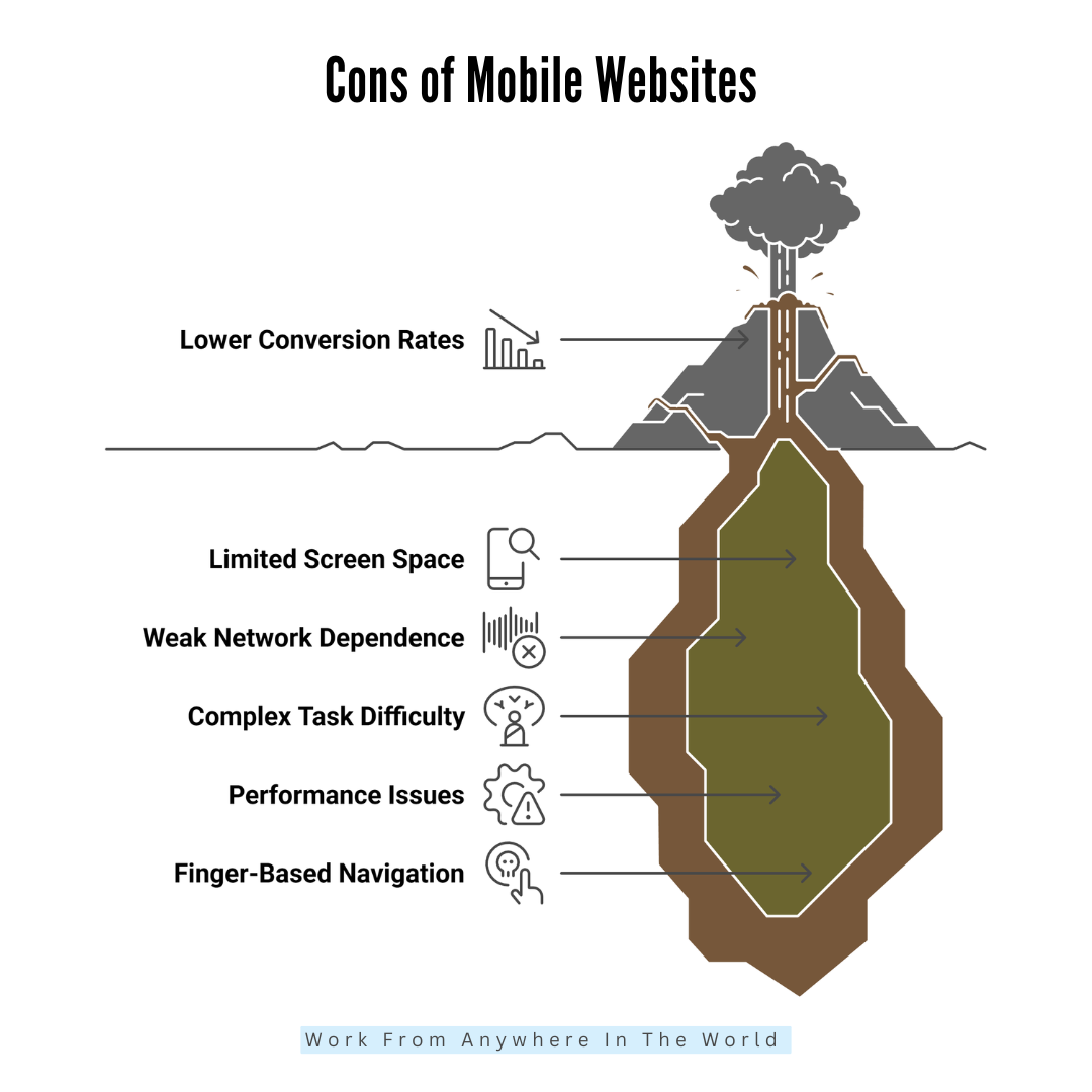
1. Limited Screen Space
One of the main issues with mobile websites is the limited screen space. Small displays leave very little room for detailed layouts or multiple elements.
When too much content is squeezed onto the screen, everything feels cluttered and overwhelming. Users must scroll more, tap more, and work harder to understand information.
Complex designs don’t translate well, and important details can get lost. Designers must prioritize only the essentials, which sometimes means removing helpful features.
While minimal layouts can look clean, they also limit creativity. Overall, smaller screens restrict how much information can be shown comfortably at one time.
2. Slower On Weak Networks
Mobile users often browse on unstable or weak networks, especially while travelling or moving between locations. Even a well-optimized mobile website can load slowly if the connection is poor.
Slow loading frustrates users quickly because they are behaviour-paced and impatient. People expect instant access, and when pages lag, they often leave before seeing anything.
Weak networks also affect images, videos, and interactive elements. Sometimes, content loads out of order or not at all. This inconsistency hurts user trust and overall experience. Mobile websites rely heavily on connection quality, and businesses can’t control where users browse from.
3. Harder To Complete Complex Tasks
Complex tasks feel harder on mobile because the experience is limited by screen size, typing difficulty, and reduced visibility. Filling long forms, comparing products, reviewing documents, or switching between tabs becomes tiring.
Users must scroll constantly, zoom in, and correct typos more often. Multitasking is also limited because switching apps interrupts the workflow. Tasks like job applications, account setups, or detailed research feel overwhelming on small screens.
Many users end up abandoning tasks and returning later on a desktop to finish them comfortably. Mobile websites work best for quick actions, not intensive or multi-step processes that require full attention.
4. Performance Issues
Mobile websites often experience performance issues, especially when they contain heavy images, animations, pop-ups, or complicated scripts.
These elements may look great on a desktop, but become slow and unresponsive on a phone. Mobile devices have less processing power, so they struggle to handle large files smoothly.
This causes lag, delayed button responses, layout shifts, or freezing screens. Users lose patience quickly when performance drops, and they often exit the website.
Even slight delays hurt the experience. A fast, lightweight mobile design is essential, but not all websites follow this rule. Poor optimization leads to noticeable issues on mobile.
5. Finger-Based Navigation
Mobile websites rely on finger-based navigation, which sounds simple but often creates usability challenges. Fingers are less precise than mouse clicks, so buttons must be larger and spaced farther apart.
If not appropriately designed, users tap the wrong button or struggle to select small elements. This leads to frustration and accidental actions.
Scrolling, zooming, and swiping also require thoughtful design to avoid misgestures. Designers must consider thumb-friendly placement, comfortable spacing, and intuitive movements.
When these elements are ignored, navigation becomes difficult. Overall, finger-based interaction demands careful planning to feel smooth, comfortable, and error-free across all devices.
6. Lower Conversion Rates
Mobile websites typically have lower conversion rates compared to desktops, even when designed well. People may browse on their phones, but they often wait to complete serious tasks on a computer.
Actions like shopping, booking travel, filling out applications, or making payments feel easier and more secure on larger screens.
Mobile checkouts also feel slow because typing is more laborious, and forms take longer. Users get distracted easily on phones, which increases drop-offs.
Minor interruptions and notifications break focus. While mobile traffic is high, it doesn’t always translate into action. This makes mobile conversions more challenging for businesses to achieve consistently.

Pros Of Desktop Websites
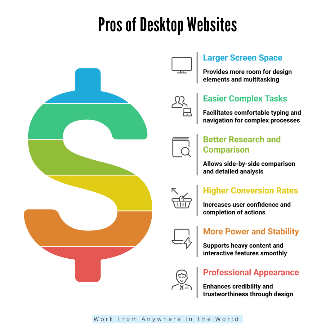
1. Larger Screen Space
Desktop websites have large screens, which gives designers more room for layouts, images, and interactive elements. Users can see multiple sections, menus, and sidebars without feeling cramped.
This space allows complex designs, detailed charts, and various columns, which are difficult on mobile. Rich visuals, high-resolution images, and videos appear more transparent and more engaging.
Users can take in more information at a glance, improving comprehension and experience. Large screens also make multitasking easier, as multiple tabs or windows can be open simultaneously. Overall, this extra screen space enhances usability, engagement, and the professional appearance of the website.
2. Easier To Complete Complex Tasks
Desktop websites are ideal for complex tasks because they provide a comfortable environment for typing, scrolling, and navigation. Users can fill out long forms, complete registrations, or perform multi-step processes with less effort.
A full keyboard makes input faster and more accurate, while a mouse allows precise clicks and selections. Multi-tab browsing lets users compare options, copy information, or reference multiple pages simultaneously.
For business tasks like accounting, analytics, or online learning, desktops provide the focus and stability needed. This ease encourages users to finish tasks without frustration, increasing conversions and overall satisfaction with the website experience.
3. Better For Research And Comparison
Desktop websites make research and comparison tasks much easier. Large screens allow users to open multiple tabs side by side, compare products, read reviews, and analyze information without constant scrolling.
Users can view high-resolution images, charts, and tables clearly, which helps in decision-making. Long-form articles and detailed content are easier to read and absorb on desktops. Users also feel more focused, with fewer distractions compared to mobile devices.
For tasks like shopping, financial planning, or academic research, desktops offer the space and precision required. This makes desktops essential for users who need depth, accuracy, and clarity when browsing.
4. Higher Conversion Rates
Desktop websites typically achieve higher conversion rates compared to mobile. Users feel more confident completing serious actions, such as making purchases, booking services, or filling out forms, because the experience is more manageable and less stressful.
Large screens reduce errors when typing information, and multiple windows make comparison simple. Users can see product details, pricing, and reviews more clearly, which increases trust. Long checkout forms or multi-step processes feel less tedious than on a mobile device.
Overall, desktop environments make users more deliberate and confident, leading to more completed actions and higher conversion rates, especially for high-value or complex transactions.
5. More Power And Stability
Desktop devices are more powerful than mobile devices so that desktop websites can handle heavy images, animations, and interactive features smoothly.
Unlike phones, desktops typically have faster processors, more RAM, and stable internet connections, which reduces lag and page errors. This allows designers to create visually rich experiences without sacrificing performance.
Users can interact with complex forms, detailed dashboards, or multimedia content without frustration. High-performance desktops also support software integrations, live chats, and advanced analytics tools.
This stability improves user satisfaction, reduces bounce rates, and builds credibility. Businesses with resource-heavy websites benefit greatly from desktops’ power and reliability.
6. Professional Appearance
Desktop websites often feel more professional and credible. Large screens and high-resolution displays allow clean, organized layouts with visible menus, sections, and branding.
Users associate well-structured websites with trustworthiness and authority. Detailed content, professional images, and interactive features look polished on desktops.
For business websites, financial services, SaaS platforms, or eCommerce, the desktop version creates confidence in users. A well-designed desktop website communicates seriousness, reliability, and professionalism, which is crucial for high-stakes decisions.
Even subtle design choices, like spacing, fonts, and layout complexity, are more effective on desktops. Overall, the professional look boosts user trust, engagement, and brand reputation.

Cons Of Desktop Websites
1. Not Portable
Desktop websites are tied to larger, stationary devices, which means users must be at home, work, or in an office to access them comfortably. Unlike mobile websites, they aren’t available on the go.
This limits casual browsing, spontaneous searches, and immediate access to information. Users can’t check quick details like addresses, menus, or store hours while commuting or running errands. Portability is a significant disadvantage, especially in today’s mobile-first world.
Businesses may miss potential visitors who prefer browsing from phones. While desktops excel for detailed tasks, their lack of portability restricts accessibility and limits traffic from casual, on-the-go users.
2. Less Traffic Than Mobile
Since more people now browse the internet on their phones, desktop websites receive less traffic than mobile ones. Casual users, social media visitors, and local searchers mostly rely on mobile devices for convenience. Desktop-only websites risk missing a large portion of potential visitors.
Even loyal users may prefer mobile when searching quickly or checking information on the move. This makes desktops less effective for spontaneous browsing, social engagement, and local marketing.
Businesses that focus primarily on desktop traffic might struggle to reach younger audiences or mobile-first users. While desktop remains vital for conversions, it cannot replace the reach and accessibility of mobile traffic.
3. Slower For Quick Actions
Desktops aren’t ideal for quick browsing or on-the-go actions. Users often prefer to pull out their phones for immediate information, like store hours, directions, contact numbers, or news updates.
Turning on a computer, booting a browser, and navigating a desktop website takes more time. For spontaneous tasks, mobile is faster and more convenient. This delay can discourage casual visitors, reducing engagement.
Desktop websites excel at detailed research and complex actions, but they are not designed for instant information retrieval. Businesses relying solely on desktops may lose visitors seeking fast answers, which makes it less effective for immediate needs.
4. Higher Design Expectations
Desktop websites require more detailed and polished designs, which increases costs and development time. Users expect large layouts with multiple sections, straightforward navigation, professional visuals, and advanced functionality.
Unlike mobile, desktops allow more creative and complex designs, so users notice flaws or inconsistencies more easily. Fonts, spacing, menus, and interactive elements must be optimized for larger screens.
Poorly designed desktops can feel cluttered or unprofessional. Designers need to invest more effort in creating a visually appealing and functional desktop experience.
These higher expectations raise design and maintenance costs, making desktop websites more demanding than simpler mobile layouts.
5. Not Ideal For Social Traffic
Most social media browsing occurs on mobile devices, so desktop websites miss a large portion of this traffic. Users click links on apps like Instagram, Facebook, or TikTok from their phones and expect quick, mobile-friendly experiences.
Desktop websites don’t capture this immediate attention because people rarely switch devices just to view a link. Social campaigns are therefore less effective when landing pages are desktop-focused. This limits engagement, click-throughs, and conversions from social channels.
While a desktop is excellent for conversions once users are on the site, it struggles to attract spontaneous visitors from mobile-first platforms, reducing overall reach.
6. Dependence On Hardware
Desktop websites depend on the user having a working computer, monitor, keyboard, mouse, and stable internet. Unlike mobile devices, desktops are stationary and require setup, power, and space. Users cannot access them on the go, which reduces convenience.
Hardware limitations like old computers, slow internet, or small monitors can affect the website experience, making pages lag or appear distorted. This dependence restricts accessibility compared to mobile devices, where devices are more uniform and portable.
Businesses targeting broader audiences must consider that some users may not have optimal desktop setups. Desktop advantages come with hardware reliance, which limits convenience and spontaneity.

Conclusion
In today’s digital world, both mobile and desktop websites are essential. Choosing the right approach requires understanding the strengths and weaknesses of mobile websites vs desktop websites to optimize user experience and conversions.
A responsive, well-designed website ensures a seamless experience across devices, balancing speed, usability, and professionalism. Ultimately, the best strategy combines mobile reach with desktop depth, creating a website that attracts, engages, and converts users effectively, no matter how they access it.
I trust you enjoyed this article on the Mobile Websites vs Desktop Websites. Please stay tuned for more insightful blogs on affiliate marketing, online business, and working from anywhere in the world.
Take care!
— JeannetteZ 🌍✨
💬 Your Opinion Is Important To Me
Do you have thoughts, ideas, or questions? I’d love to hear from you. Please leave your comments below or email me directly at Jeannette@WorkFromAnywhereInTheWorld.com.
📚 More Work From Anywhere Reads
🚀 Ready to Build a Business You Can Run from Home
Or from Anywhere in the World?
Imagine creating income on your terms — from home, a cozy café, or wherever life takes you.
With the right tools, training, and community support, it’s entirely possible.
Start your own online business for free — no credit card needed.
Disclosure
This post may contain affiliate links. As an Amazon Associate and participant in other affiliate programs, I earn from qualifying purchases at no extra cost to you. Please read my full affiliate disclosure.


