How To Create A Landing Page In Wix
Creating a landing page on Wix is a simple yet powerful way to boost conversions, showcase products, or capture leads.
Whether you're promoting an event, offering a freebie, or launching a new service, Wix provides intuitive tools to design a page that aligns with your goals.
In this article, we’ll walk you through how to create a landing page in Wix using intuitive tools to create a page that aligns with your goals—no coding required.
What Is A Landing Page?
A landing page is a targeted website that is created with the express purpose of converting visitors into leads, clients, or subscribers.
Unlike other websites, landing pages focus on a single action, such as completing a form, making a purchase, or subscribing to a newsletter. This targeted approach is why landing pages are vital in digital marketing campaigns.
A landing page needs a clear headline that conveys the offer's value, persuasive content that highlights features or benefits, and a strong CTA such as “Download Now” or “Sign Up.” These elements guide users to take action and improve conversions.
Most landing pages also include a simple, user-friendly form that asks for minimal information to maximize conversions, typically an email address or name.
Another essential feature is trust signals such as testimonials, reviews, and security badges, which help reassure visitors. Landing pages often use visual elements, such as images, videos, or infographics, to enhance the overall message and increase engagement.
Ultimately, a landing page is designed to remove distractions and focus solely on conversion, making it an essential tool for businesses running ads, promotions, or email campaigns. It helps capture leads, track data, and optimize marketing efforts for higher returns.

What Is Wix.com
Wix.com is a cloud-based web development platform that enables users to create professional websites without coding.
Founded in 2006 by Avishai Abrahami, Nadav Abrahami, and Giora Kaplan, Wix began as a simple drag-and-drop website builder and has since evolved into a comprehensive website creation platform.
Today, it serves over 250 million users globally, from individuals and small businesses to large enterprises. Wix's drag-and-drop editor, which lets customers modify their websites without technical knowledge, is one of its standout features.
Wix also offers AI-powered website creation tools, such as Wix ADI (Artificial Design Intelligence), which automatically designs a site based on user input.
Additionally, Wix provides hundreds of customizable templates, eCommerce capabilities, SEO tools, and a variety of apps and integrations to enhance functionality. Users can add features like blogs, contact forms, booking systems, payment gateways, and more.
Under Wix's freemium model, users can start with a free Wix subdomain or upgrade to a premium plan to access features such as custom domains, additional storage, and advanced marketing tools.
Over the years, Wix has become a leader in website creation, offering beginner-friendly and advanced tools for a wide range of needs, making it accessible to users at all experience levels.

How To Create A Landing Page In Wix
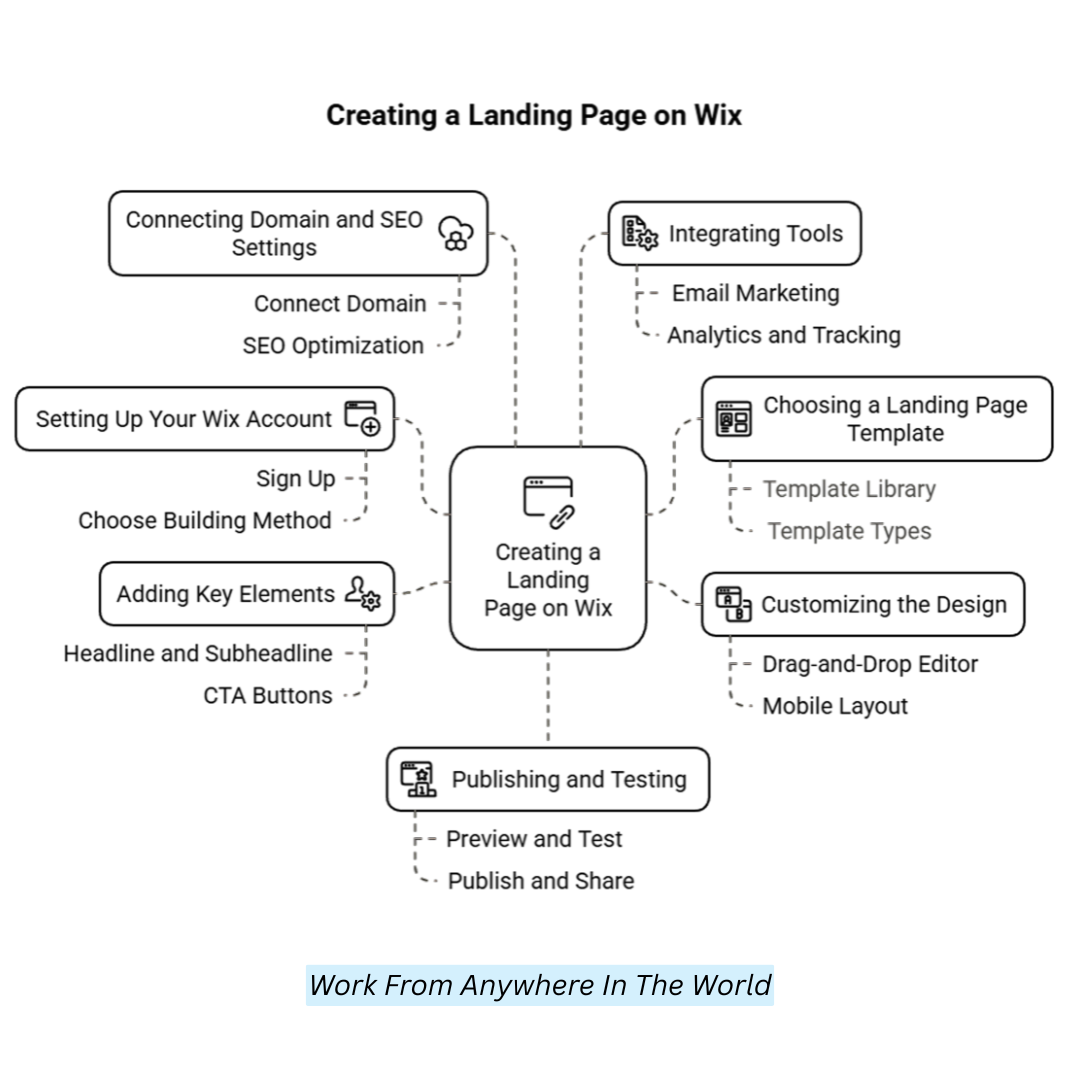
1. Setting Up Your Wix Account
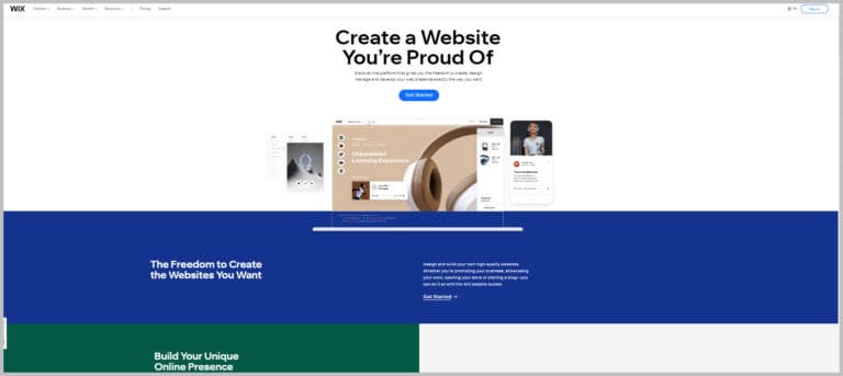
To begin creating a landing page, first set up your Wix account. Visit Wix.com and click “Get Started.” You can sign up with your email or log in using Google or Facebook.
Wix will ask a few quick questions about your website’s purpose, such as for a business, portfolio, blog, or online store. Then, you'll choose how to build your site: let Wix ADI (Artificial Design Intelligence) create one based on your answers, or use the Wix Editor for full creative control. After completing the setup, you’ll be taken to your Wix dashboard.
This is your central control center, where you can manage multiple websites, connect domains, view traffic analytics, use SEO and marketing tools, and access helpful resources to grow your site.
2. Choosing A Landing Page Template
Wix offers hundreds of templates, many optimized for landing pages. Here's how to pick one. From the dashboard, click “Create New Site.”
Choose “Business” or the category that fits your project. When prompted, select “Choose a Template.” Select a template from the Marketing & Advertising > Landing Pages section in the template library to learn how to create a landing page in Wix.
Top template types include product launch pages, coming-soon pages, event promotion pages, and lead-capture pages. Preview templates before selecting to ensure the layout aligns with your goals.
Alternatively, start with a blank template for complete design freedom. Remember, templates are fully customizable—colours, fonts, images, and sections can be changed to suit your brand.
3. Customizing The Design
Wix’s drag-and-drop editor makes it easy to tailor your landing page design. Any text box can change its content, font size, style, and orientation by clicking on it.
Adjust colours using your brand’s palette for consistency. Go to Site Design > Customize > Colours. Upload your logo and position it for maximum visibility.
Adding or removing elements by dragging images, text, shapes, and buttons into your layout or deleting unused elements. Click the smartphone icon to view your mobile layout and rearrange elements to enhance the mobile experience.
Design tips include using consistent fonts and colours, leaving sufficient white space for readability, using high-quality images relevant to your offer, and ensuring CTA buttons stand out with high contrast.
4. Adding Key Elements To Your Landing Page
When learning how to create a landing page in Wix, it's crucial to include a strong headline and subheadline that communicate the value of your offer.
The subheadline can elaborate briefly. For example, a headline like “Grow Your Email List Fast” can be paired with a subheadline like “Get our free guide to triple your subscriber count in 30 days.”
Use a strong visual such as a product shot, an engaging photo, or a short video to capture attention. CTA buttons should guide users toward your goal using actionable text like “Download Now,” “Sign Up Free,” or “Get Started.”
Use bold, contrasting colours and place buttons above the fold and further down the page. Use Wix Forms to collect emails, names, or phone numbers to create lead capture forms.
Keep forms short and include a link to the privacy policy to build trust. Show honest customer feedback or recognizable logos of companies you’ve worked with.
Use testimonial carousels or quote blocks, including trust badges like “SSL Secured” or “Money-Back Guarantee.” You can also add urgency and scarcity elements, such as countdown timers, limited-time offers or limited spots available.
Wealthy Affiliate – Mini Review (2025)
If you’ve ever thought about turning your blog, passion, or niche into an online business,
Wealthy Affiliate (WA) is one of the most beginner-friendly platforms I’ve used.
It combines step-by-step training, website hosting, SEO research tools,
and an active community all in one place.
What I like most: you can start free (no credit card needed),
explore lessons, test the tools, and connect with other entrepreneurs
before upgrading. WA isn’t a “get rich quick” scheme — it’s a platform where success comes
from consistent effort and applying what you learn.
5. Connecting Domain And SEO Settings
A key step in creating a landing page in Wix is connecting a custom domain to enhance professionalism, trust, and SEO performance.
From the dashboard, click “Connect Domain.” Purchase a domain via Wix or connect an existing one. A branded URL boosts trust and SEO.
Optimize for search engines by going to Page Settings > SEO Basics and adding a page title, meta description, and focus keywords. Use image alt tags for SEO and accessibility, and ensure your page loads quickly by optimizing images.
6. Integrating Tools
Wix supports third-party tools and built-in automation. Connect to Wix Email Marketing, Mailchimp, or ConvertKit to manage email marketing. Use automated email replies for instant follow-up.
For analytics and tracking, add Google Analytics to monitor page performance and install Facebook Pixel for ad tracking. Wix includes a CRM dashboard to manage leads, allowing you to view contacts, activity history, and communications in one place.
Use Wix Automations to create workflows. For example, send a thank-you email or notify your team when someone submits a form.
7. Publishing And Testing Your Landing Page
Before going live, preview your landing page on desktop and mobile. Test all forms and links to ensure they function as expected. Check loading speed and fix any issues.
When ready, click “Publish” in the top right corner. Share your URL with your audience or run ads to drive traffic. Use Wix Multilingual or Duplicate Page to run A/B tests. Test different headlines, CTAS, or form placements and compare performance in Wix Analytics.
Set goals in Google Analytics to track conversions, such as form submissions. Track CTA clicks using Wix’s event tracking.
What Are Landing Pages Good For?
Knowing how to develop a landing page on Wix will enable you to design targeted, high-converting pages suited to particular objectives, such as product sales or lead generation.
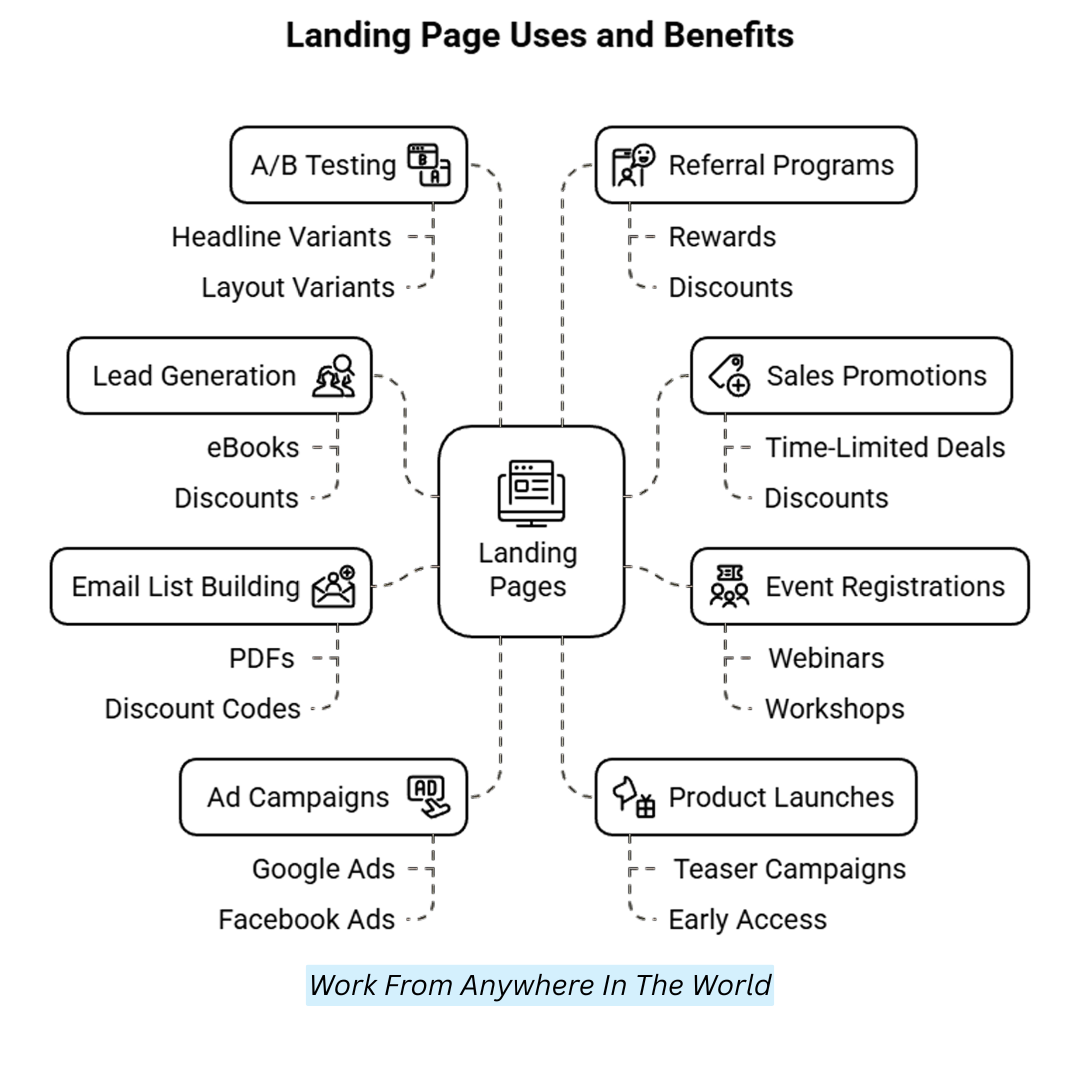
They’re designed with a single focus or call to action (CTA), such as signing up for a newsletter, downloading an eBook, registering for a webinar, or making a purchase. Here’s what they’re perfect for:
1. Lead Generation
In exchange for anything of value, such as an eBook, discount, free trial, or exclusive content, lead generation gathers potential clients' names, emails, and phone numbers.
Knowing how to create a landing page in Wix is essential for effective lead generation, as it helps you present compelling offers and clear calls to action to capture visitor information.
Visitors fill out a form to access the offer; their details are stored in a database. Personalized offers or email campaigns are examples of follow-up marketing that leverage this contact information to move leads through the sales funnel and foster relationships. Creating quality leads increases conversion and expands your clientele.
2. Sales Promotions
Sales promotions drive quick sales by offering time-limited deals or discounts on specific products. The process starts with identifying a product or service to promote and setting clear goals, like clearing inventory or boosting seasonal sales. Next, an attractive offer is created, such as a percentage discount, buy-one-get-one deal, or free shipping.
This offer is then promoted through landing pages, emails, social media, and ads. The promotion runs for a limited period to create urgency.
When executed well, sales promotions increase customer engagement, encourage impulse purchases, and generate a spike in revenue within a short timeframe.
3. Event Registrations
Event registrations help streamline the sign-up process for webinars, workshops, or in-person events. The first step is to create a specific landing page containing event information, including the date, time, place, agenda, and a basic registration form.
Visitors enter their contact info to reserve a spot. Automated confirmation emails are sent instantly, often including event links or tickets.
Integrations with calendars or reminders keep attendees informed. Wix and similar platforms allow easy setup with RSVP tools, payment options (if needed), and attendee management features. This process simplifies planning, boosts attendance, and ensures a smooth experience for organizers and participants.
4. Email List Building
Email list building involves offering valuable freebies, such as PDFs, eBooks, or discount codes, to encourage visitors to subscribe to your email list. The process begins by creating a high-quality offer that aligns with your audience's interests.
Next, you design a landing page with a clear call-to-action and an email opt-in form. When visitors enter their contact details, they receive the freebie via email.
This provides immediate value to subscribers and grows your email list for future marketing campaigns. Over time, a strong email list helps nurture relationships, build trust, and increase conversions.
5. Ad Campaigns
Ad campaigns drive targeted traffic to a specific landing page through pay-per-click (PPC) or social media ads. The process begins by creating an ad with a compelling message that aligns with your product or service, and running it on platforms such as Google Ads or Facebook.
The ad directs users to a focused landing page designed to convert, whether through a sign-up form, a purchase button, or another call to action.
The landing page is optimized for the ad's offer, ensuring relevance and improving conversion rates. Analyzing ad performance helps refine future campaigns for better targeting and ROI, maximizing marketing efforts.
6. Product Launches
Product launches generate excitement and interest before or during a new product launch. The process starts by building anticipation with teaser campaigns—using email, social media, or landing pages to hint at the upcoming product. Early access, exclusive previews, or special discounts can engage potential customers.
On launch day, a dedicated landing page with key product details and a clear call to action (e.g., “Buy Now” or “Pre-order”) is crucial.
Continuous engagement through follow-up emails or social media posts helps maintain momentum, while collecting post-launch feedback helps refine future marketing strategies. Effective product launches build brand awareness and drive immediate sales.
7. A/B Testing
Comparing two versions of a webpage, email, or advertisement to determine which performs better is known as A/B testing. The process starts by creating two variants with a different headline, layout, or call-to-action (CTA).
These versions are then shown to various segments of your audience. You track performance metrics such as click-through rates, conversions, and time spent on the page.
After the test period, the version with the better results is selected for use. A/B testing enables data-driven decisions to optimize user experience, increase conversion rates, and boost marketing effectiveness.
8. Referral Programs
Referral programs use landing pages to encourage current customers to refer friends, family, or colleagues in exchange for rewards, discounts, or other incentives.
The process involves creating a landing page that explains the referral offer and provides an easy way for users to share a referral link.
When a referred individual completes a desired action, such as signing up or making a purchase, both the referrer and the new customer benefit.
This strategy helps businesses grow their customer base by leveraging word-of-mouth and incentivizing existing users to refer others.
FAQs
Q1: Do I Need To Pay To Create A Landing Page On Wix?
No, you can create a landing page using Wix’s free plan. However, you'll need a premium plan to remove Wix ads and connect a custom domain.
Q2: What’s The Difference Between A Wix Landing Page And A Full Website?
A website usually consists of several pages (home, about, contact, etc.), whereas a landing page is a single, targeted page.
Q3: Can I Use Wix Templates For Landing Pages?
Yes! Wix offers customizable landing page templates for different purposes like product launches, event registrations, and email sign-ups.
Q4: How Do I Connect A Form To Collect Emails On My Landing Page?
Use the Wix Forms widget to add a contact or sign-up form, and connect it to Wix Contacts or an external email marketing service like Mailchimp.
Q5: Will My Wix Landing Page Be Mobile-Friendly?
Yes, Wix automatically optimizes your landing page for mobile. You can also customize the mobile view manually in the Wix Editor.
Q6: Can I Track The Performance Of My Wix Landing Page?
Absolutely. You can integrate tools like Google Analytics or use Wix’s built-in analytics to monitor traffic, bounce rates, and conversions.
Q7: How Do I Set My Landing Page As The Homepage?
In the Wix Editor, go to the Pages menu, click the settings of your landing page, and select “Set as Homepage.”
Conclusion
Once your account is set up, learning how to create a landing page in Wix is the next step to showcase your content or offer effectively.
Registering, selecting a template, and personalizing your website can quickly establish your online presence. Wix provides all the tools you need to realize your idea, whether you're creating a portfolio, personal blog, or online store. Use the platform's easy-to-use tools to start building a beautiful website.
I trust you enjoyed this article on How To Create A Landing Page In Wix. Please stay tuned for more insightful blogs on affiliate marketing, online business, and working from anywhere in the world.
Take care!
— JeannetteZ 🌍✨
💬 Your Opinion Is Important To Me
Do you have thoughts, ideas, or questions? I’d love to hear from you. Please leave your comments below or email me directly at Jeannette@WorkFromAnywhereInTheWorld.com.
📚 More Work From Anywhere Reads
🚀 Ready to Build a Business You Can Run from Home
Or from Anywhere in the World?
Imagine creating income on your terms — from home, a cozy café, or wherever life takes you.
With the right tools, training, and community support, it’s entirely possible.
Start your own online business for free — no credit card needed.
Disclosure
This post may contain affiliate links. As an Amazon Associate and participant in other affiliate programs, I earn from qualifying purchases at no extra cost to you. Please read my full affiliate disclosure.
