How To Create A One-Page Website
In a fast-paced digital world, simplicity wins. That’s why one-page websites, with their sleek, focused, and easy-to-navigate design, have become increasingly popular for portfolios, startups, events, and even businesses.
If you’re wondering how to create a one-page website that’s both beautiful and functional, rest assured, it's simpler than you think.
This detailed guide will walk you through every step to craft a stunning one-page site from scratch, empowering you to build a strong online presence with ease.
What Is A One-Page Website?
A one-page website is a site where all content is displayed on a single, continuous page. Instead of clicking through multiple pages, users scroll vertically to navigate different sections such as About, Services, Portfolio, Testimonials, and Contact.
The navigation menu often uses anchor links that smoothly move users to the desired section, creating a seamless experience.
Key features of a one-page website include smooth scrolling navigation, responsive design for mobile and tablet users, and faster loading speeds — important because 53% of visitors leave a website if it takes longer than 3 seconds to load.
The layout is typically minimalist, focusing on a clean structure that tells a story from top to bottom. Designers often include visually engaging elements like parallax scrolling, animations, and bold imagery to keep users interested.
With fewer distractions, one-page websites usually highlight strong calls-to-action, encouraging visitors to sign up, purchase, or contact easily.
The purpose of a one-page website is to deliver information quickly and efficiently. It is ideal for portfolios, small businesses, product promotions, and event announcements that require a focused and impactful online presence.
Studies show that one-page websites can boost conversion rates by up to 37% because they guide users along a clear, controlled journey without interruption.
Organizations and people looking for speed and simplicity can find a contemporary, user-friendly answer in one-page websites.
Benefits Of A One-Page Website
In the realm of web design, less is indeed more. An inventive, efficient way to disseminate information without overwhelming your visitors is through one-page websites.
They focus on delivering a seamless experience, and the benefits extend beyond mere style. They can significantly boost your online presence, engage your audience, and drive your business goals, making the journey of creating a one-page website an exciting and rewarding one.
Here’s why a one-page website might be the perfect choice:
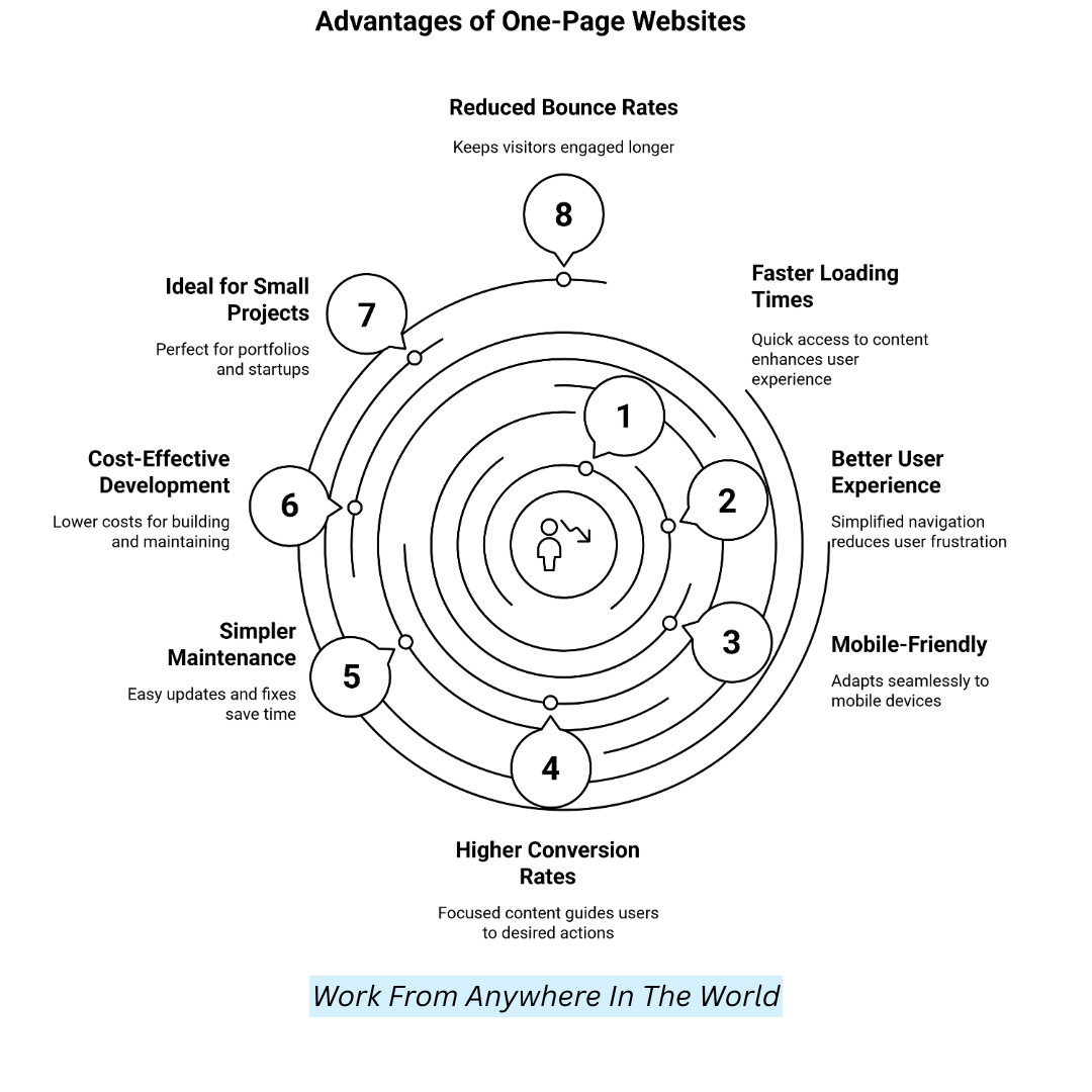
1. Faster Loading Times
One-page websites load quicker because there are fewer assets and no need to switch between multiple pages. Faster loading reduces bounce rate, improves SEO rankings, and creates a smooth experience that encourages users to stay longer and explore.
2. Better User Experience
Without complex navigation or endless clicking, users can easily scroll through content in a natural flow. Everything they need is organized clearly on one page, reducing confusion and frustration, nd allowing them to find information quickly and effortlessly.
3. Mobile-Friendly
Single-page designs naturally fit the swipe-and-scroll behaviour of smartphone and tablet users. They adapt beautifully to smaller screens, providing intuitive navigation, faster interaction, and a more enjoyable mobile browsing experience that keeps users engaged wherever they are.
4. Higher Conversion Rates
A streamlined, focused journey on one page minimizes distractions and guides users toward a single goal, whether filling out a form, purchasing, or signing up. Conversion rates are frequently greater with this focused strategy than with conventional multi-page websites.
5. Simpler Maintenance
Simpler maintenance means you only need to edit one page, saving time on updates, fixes, and content refreshes. With fewer technical issues to worry about, it’s easy to keep your website modern, relevant, and running smoothly without extra stress or complicated work.
6. Cost-Effective Development
Building and maintaining a one-page website is often much cheaper than creating a full multi-page site. Typically, a simple one-page website costs between $500 and $2,000, depending on design complexity, compared to $3,000 to $10,000 for larger websites.
7. Ideal For Small Projects
A one-page website is perfect for portfolios, product launches, events, and startups that need a clear, compact online presence.
It's an efficient way to showcase your brand, convey key information, and encourage action, without overwhelming visitors.
8. Reduced Bounce Rates
Since all content is on a single page, visitors are less likely to leave quickly. The seamless scrolling experience keeps users engaged, encouraging them to interact with the content, explore more sections, and ultimately stay longer on the site.
How To Create A One-Page Website
Building a one-page website requires careful planning, innovative design, and focused execution. Create a beautiful, functional website that inspires people to act by using these methodical techniques.
Step 1: Define Your Website’s Purpose
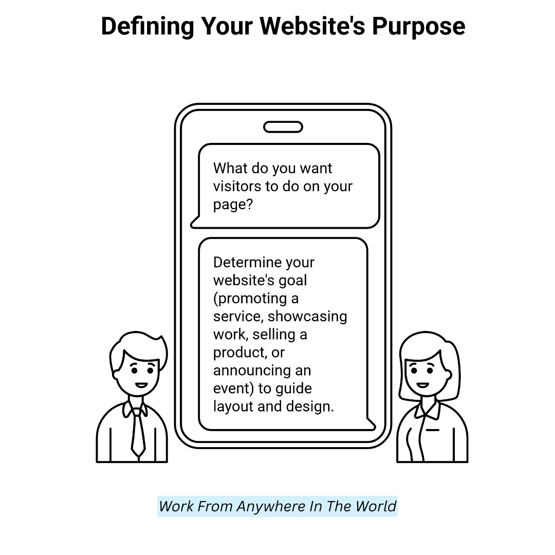
Start by getting extremely clear about the goal of your website. Ask yourself: What do you want visitors to do once they land on your page?
Are you promoting a service, showcasing your work, selling a product, or announcing an event? The purpose determines everything from layout to design choices. With a one-page site, focus is crucial.
Since you have only one scrollable page to tell your story, knowing the end goal will help you prioritize which content, sections, and visuals are essential to drive the desired action from your audience. Write down your goal clearly before moving forward.
Step 2: Plan Your Content Structure
A good one-page site flows naturally like a story. Begin by sketching or listing the sections you’ll need. Standard sections include a hero introduction, an about section, services or features, a portfolio or gallery, testimonials, and a contact section.
Arrange them in the order that best guides your visitor from awareness to action. Visualize each section as a chapter in your story, leading users seamlessly down the page.
Planning prevents overcrowding or missing key points. Tools like Figma, Canva, or even basic pen-and-paper are great for mapping this out visually. A solid content structure saves time later.
Step 3: Choose The Right Website Platform
Select a website platform that matches your technical skills and goals. If you want easy drag-and-drop editing, platforms like Wix, Squarespace, and Webflow are great options.
For greater flexibility and ownership, WordPress is ideal, especially when paired with a one-page theme such as Astra or Hestia. Web developers typically start from scratch with HTML, CSS, JavaScript, and frameworks such as Bootstrap.
Consider factors such as customization options, mobile responsiveness, SEO friendliness, hosting requirements, and your comfort level with technology. Each platform offers trade-offs among simplicity, design freedom, and scalability, so choose carefully before building.
Step 4: Select A Professional One-Page Template
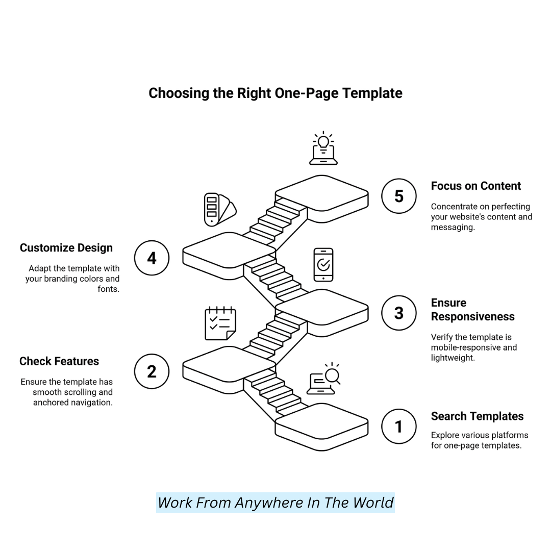
Picking the right template can fast-track your website creation process. Search for templates built explicitly for one-page sites, featuring smooth scrolling, anchored navigation, and a modern layout.
Look for templates that are mobile-responsive, lightweight, and easy to customize. Prioritize a clean, minimalistic design where sections flow naturally into one another without feeling cluttered.
Platforms like Squarespace, Wix, and WordPress offer specialized one-page themes. Remember, good templates provide a strong structure but allow branding colours, fonts, and images to be flexible.
Starting with a professional template reduces design stress and lets you focus more on perfecting your content and messaging.
Step 5: Design With User Experience (UX) In Mind
User experience is everything, especially on a one-page site. Design should be intuitive, meaning users immediately understand how to interact with the site.
Use a sticky navigation bar that follows users as they scroll, allowing quick jumps between sections. Maintain a strong visual hierarchy: big headlines, concise subheadings, and plenty of whitespace.
Break up text with bullet points, icons, and visuals to simplify scanning. Incorporate subtle animations for engagement, but avoid excessive effects that distract.
Always design with your audience in mind, considering their needs and expectations. A good UX keeps users engaged until your CTA.
Wealthy Affiliate – Mini Review (2025)
If you’ve ever thought about turning your blog, passion, or niche into an online business,
Wealthy Affiliate (WA) is one of the most beginner-friendly platforms I’ve used.
It combines step-by-step training, website hosting, SEO research tools,
and an active community all in one place.
What I like most: you can start free (no credit card needed),
explore lessons, test the tools, and connect with other entrepreneurs
before upgrading. WA isn’t a “get rich quick” scheme — it’s a platform where success comes
from consistent effort and applying what you learn.
Step 6: Write Clear, Focused Content
On a one-page website, each word must have a purpose. Create a compelling hero message that immediately explains your offerings and their significance.
Keep descriptions concise but powerful, using active language. For services or features, explain benefits rather than just listing specifications.
If you include a portfolio, use captions that describe the project's impact. Testimonials should feel authentic and directly address visitor concerns.
End each section with a mini call-to-action nudging readers downward. Good one-page content acts like a conversation: each sentence pulls users closer to saying “yes” to you, primarily in the CTA at the bottom.
Step 7: Add High-Quality Visuals And Media
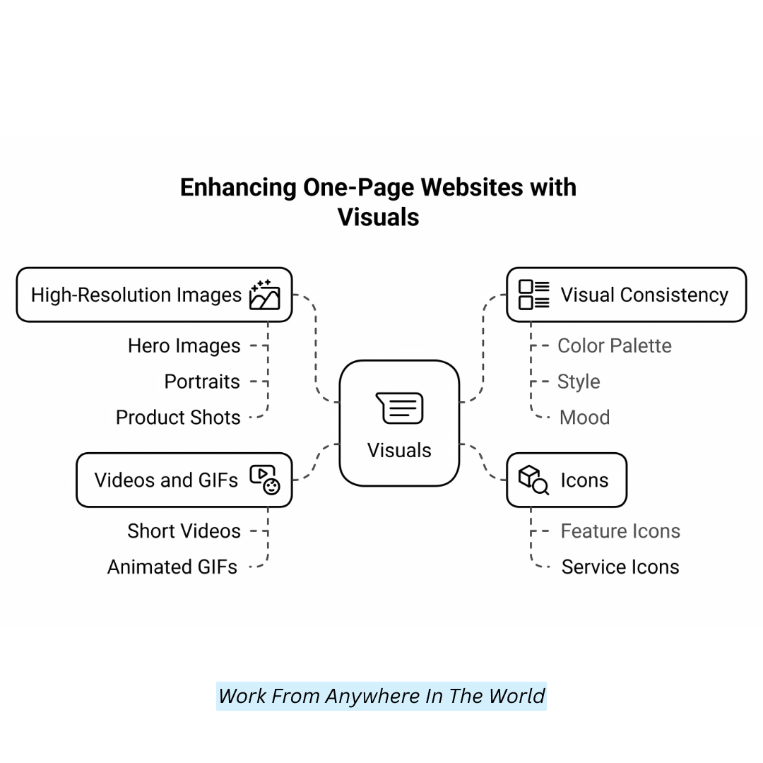
Visuals are crucial on a one-page website because they deliver messages instantly. Use high-resolution hero images, professional portraits, product shots, or project showcases.
Integrate icons to explain features or services quickly without overloading text. If relevant, use short videos or animated GIFS to boost engagement, but optimize them to prevent slowing down your site.
Maintain visual consistency — stick to a cohesive colour palette, style, and mood. Avoid stock photos that feel generic. Every image should enhance your story, not just decorate it. Remember: visuals set the emotional tone and can often communicate faster than written content.
Step 8: Ensure Mobile Responsiveness
Mobile responsiveness is essential because mobile devices account for over half of website traffic. Test how your design adjusts across different screen sizes.
Text must be readable without zooming, buttons must be large enough to tap easily, and images should resize without distortion.
Columns often stack vertically on smaller screens, so preview layouts carefully. Avoid hover-only effects since they don’t work on mobile.
Most website builders, such as Wix and Squarespace, offer mobile editors; use them. Also, test real devices if possible — emulators aren't always perfect. A flawless mobile experience keeps your audience engaged and converts better.
Step 9: Set Up Smooth Scrolling Navigation
Smooth scrolling is a signature feature of great one-page websites. Instead of loading new pages, clicking navigation links should smoothly slide visitors to the correct section.
This creates a seamless, fluid experience. This feature is often automatic in website builders when linking to section IDS. If you’re coding manually, use anchor links and enable smooth behaviour via simple JavaScript or CSS scroll-behaviour.
Ensure the section IDs match your navigation links exactly. Add a scroll indicator, if necessary, to indicate there’s more content below. Smooth scrolling subtly guides visitors through your story without breaking immersion or attention.
Step 10: Create A Strong Call-to-Action (CTA)
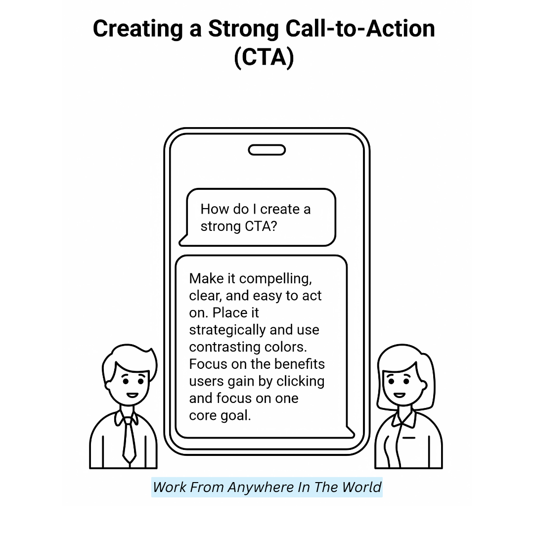
Your call-to-action is the climax of your one-page journey. It needs to be compelling, crystal clear, and easy to act on. Whether it’s “Book a Consultation,” “Download Now,” or “Contact Us,” place your CTA strategically — in the hero section, mid-page reminders, and at the bottom.
Use contrasting button colours to make it stand out. The CTA text should be benefit-driven, focusing on what users gain by clicking.
Don’t ask visitors to take multiple actions; focus on a single core goal. Good CTAS remove friction and hesitation, turning passive readers into active leads, buyers, or fans.
Step 11: Optimize Website Speed
Speed optimization is essential since a one-page website loads all content at once. Start by compressing images without sacrificing quality using tools like Tinypng.
Minify your CSS, JavaScript, and HTML files to remove unnecessary code. Ensure that movies and images load only when they enter the viewport using lazy loading.
Host on a fast server or use a Content Delivery Network (CDN) to reduce latency. Avoid bloated plugins or unnecessary third-party scripts.
Finally, run tests using Google PageSpeed Insights or GTMetrix to identify issues and resolve them before launch. Faster sites keep users happy.
Step 12: Implement Basic SEO Best Practices
Your website needs SEO to be found by search engines, even if it is only one page long. Start with a strong page title and meta description, including your primary keyword.
Structure your sections using proper heading tags (H1 for the main title, H2S for section headers). Use descriptive alt text for images.
Optimize URL slugs to be short and meaningful. If you’re targeting local traffic, mention your city or region naturally within the text. Install a simple SEO plugin if you’re using WordPress.
Well-optimized single-page sites can rank competitively, primarily if your content is tightly focused and relevant.
Step 13: Test Everything Thoroughly
Before going live, perform a thorough check. Test the navigation links to ensure smooth scrolling works correctly. Check all forms (contact, newsletter signups) to ensure submissions are delivered.
Test across multiple browsers (Chrome, Firefox, Safari, Edge) and devices (mobile, tablet, desktop). Look for typos, broken links, or formatting issues.
Having a few friends or colleagues review it will help you see things you might have missed. Also, test loading speeds and fix any performance issues.
Testing isn’t glamorous, but catching small mistakes early protects your reputation and gives visitors a seamless experience from their first click.
Step 14: Publish Your Website
Once you’ve tested thoroughly and made final tweaks, it’s time to publish! Select a memorable domain name that is consistent with your brand, then configure it using your hosting platform.
Double-check that your SSL certificate (https) is active for security and credibility. Launching a website is exciting, but remember — it’s not the finish line.
After publishing, stay vigilant for bugs, broken links, or performance drops. Set Google Analytics to start tracking traffic immediately.
Congratulate yourself — getting your one-page site live is a huge accomplishment! Now, you’re ready to start promoting your digital home to the world.
Step 15: Promote Your One-Page Website
After launching, it’s crucial to drive traffic to your one-page site. Use your business cards, email newsletters, and social media accounts to spread the word.
Announce the launch to your network and encourage them to visit and share. If you have a blog or create content, link back to your one-page site.
Set up a Google My Business profile if it’s a local service. Consider light paid advertising (Facebook Ads, Google Ads) targeting your ideal audience.
SEO efforts will help in the long term, but promotion will get immediate visibility for your site. A strong launch sets the tone for growth.
FAQs
Q1: How Do I Choose The Right Platform For My One-Page Website?
Select a platform according to your requirements and technical expertise. Easy-to-use options like Wix, Squarespace, and Webflow are great for beginners, while WordPress offers more customization. Developers prefer building a site from scratch using HTML, CSS, and JavaScript.
Q2: Can I Create A One-Page Website Without Coding?
Yes! Website builders like Wix, Squarespace, and Webflow offer drag-and-drop functionality, making it possible to create a beautiful one-page website without any coding knowledge.
Q3: How Can I Ensure My One-Page Website Is Mobile-Responsive?
Try your website on various screens and devices. Use mobile editors in platforms like Wix and Squarespace, and ensure text is readable, buttons are tappable, and images resize without distortion.
Q4: Can A One-Page Website Be Used For E-Commerce?
Yes, a one-page website can include an e-commerce section for selling products. You can integrate payment gateways and product galleries, but make sure the design remains clean and user-friendly.
Q5: How Do I Add Smooth Scrolling To My One-Page Website?
Smooth scrolling can be added easily through website builders or by using anchor links and simple JavaScript or CSS for custom-built sites. Ensure that the section IDS matches your navigation links.
Conclusion
In conclusion, creating a one-page website is an effective way to present your content in a streamlined, user-friendly format.
By following the steps outlined above, you’ll have a clear roadmap for creating a one-page website that is visually appealing and functional. With the right strategy, your one-page website can engage visitors and effectively meet your business goals.
I trust you enjoyed this article on How To Create A One-Page Website. Please stay tuned for more insightful blogs on affiliate marketing, online business, and working from anywhere in the world.
Take care!
— JeannetteZ 🌍✨
💬 Your Opinion Is Important To Me
Do you have thoughts, ideas, or questions? I’d love to hear from you. Please leave your comments below or email me directly at Jeannette@WorkFromAnywhereInTheWorld.com.
📚 More Work From Anywhere Reads
🚀 Ready to Build a Business You Can Run from Home
Or from Anywhere in the World?
Imagine creating income on your terms — from home, a cozy café, or wherever life takes you.
With the right tools, training, and community support, it’s entirely possible.
Start your own online business for free — no credit card needed.
Disclosure
This post may contain affiliate links. As an Amazon Associate and participant in other affiliate programs, I earn from qualifying purchases at no extra cost to you. Please read my full affiliate disclosure.

