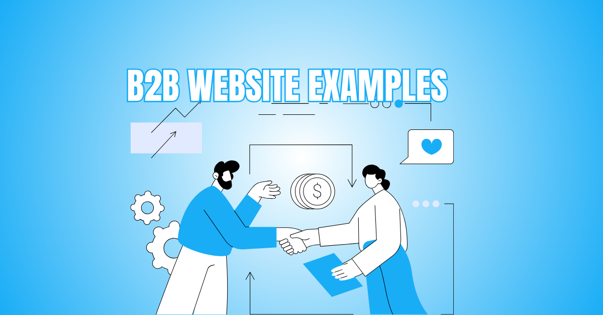
B2B Website Examples That Truly Inspire Success
Looking to elevate your business website? Exploring successful B2B website examples can offer valuable insights into what works in today’s competitive digital landscape. From intuitive navigation to compelling design and persuasive messaging, the best B2B sites are built to convert.
In this guide, we’ll showcase standout B2B websites that blend strategy and style—perfect inspiration for your next website redesign or fresh launch.
B2B Website Examples
1. Slack – Simplicity Meets Productivity
Slack’s B2B website delivers a seamless user experience that emphasizes productivity and ease of communication. There aren't many distractions in the sleek, contemporary style.
Its headline immediately communicates the platform's core benefit—team collaboration. CTAs such as “Try for Free” and “Talk to Sales” are strategically placed to encourage action at all stages of the buyer journey.
Slack uses animations and product walkthroughs to communicate its features, making complex tools feel intuitive visually.
Additionally, customer testimonials and brand logos build trust quickly. The homepage allows businesses to identify how Slack fits into their workflow, whether they're startups or enterprises.
With dedicated sections for developers, IT teams, and managers, Slack ensures each visitor finds relevant content easily. It also integrates well with third-party tools, which is highlighted throughout the site.
The Slack website is an excellent example of how simplicity, clarity, and functionality can combine to attract and convert B2B leads.
2. IBM – Complex Made Accessible
IBM’s B2B website showcases how a technology giant can make a vast range of complex solutions digestible. Despite the breadth of services—cloud computing, AI, quantum, and consulting—the site organizes information intuitively.
The homepage uses precise segmentation to guide visitors to content based on their interests or industries. A personalized journey is created through dropdowns and role-specific pathways.
IBM emphasizes thought leadership with easy access to research papers, blogs, and whitepapers, making it a go-to resource hub for B2B decision-makers.
Interactive content like AI demos and customer success stories provides credibility and deepens engagement. IBM's colour palette and branding are professional and consistent, helping establish authority.
The site supports multiple languages and accessibility features, which is critical for a global audience. Overall, IBM balances technical depth with user-friendly navigation, making its site a stellar example of how to present enterprise-level solutions without overwhelming the user.
3. HubSpot – Conversion-Driven Design
HubSpot’s B2B website exemplifies conversion-focused design paired with value-rich content. Its layout is optimized to guide users from awareness to action, prominently featuring CTAs like “Get a Demo,” “Start Free,” and “Contact Sales.”
The homepage speaks directly to its diverse personas—marketers, salespeople, and service professionals—with custom navigation paths.
HubSpot also excels at content marketing, offering free tools, templates, eBooks, and certifications right from the homepage.
The use of animated visuals and video testimonials highlights the platform's capabilities while building trust. Real-time chat and smart content personalization enhance the browsing experience, ensuring visitors see the most relevant information.
Finding information is simple thanks to the clear layout, abundant whitespace, and simple organization. HubSpot also integrates product tours and comparison charts that support buyers during evaluation.
With SEO optimization and fast load times, HubSpot’s site is not just attractive—it's strategically built to nurture and convert leads.
4. Mailchimp – Creative And User-Friendly
Mailchimp’s B2B website stands out with its bold, quirky visuals paired with professional UX design. Small and mid-sized organizations can now feel comfortable implementing marketing automation because it finds the ideal mix between creativity and clarity.
The homepage immediately addresses core pain points, like reaching more customers and saving time, using conversational language.
Each section leads to detailed product features with animated walkthroughs and use-case examples. The bright colour palette and custom illustrations draw the eye, while the layout remains digestible and straightforward.
Mailchimp’s CTAs—like “Sign Up Free” or “Pick a Plan”—are visible and conversion-focused. The site offers various resources such as marketing guides, a business glossary, and customer success stories.
These help build trust and position Mailchimp as a supportive partner for business growth. With responsive design and strong mobile performance, Mailchimp’s site proves that a fun and creative experience can still be a high-converting B2B platform.
5. Salesforce – Enterprise-Focused Functionality
Salesforce’s website exemplifies enterprise-level web design with its organized, modular layout and role-specific content delivery.
Its homepage instantly communicates credibility through brand logos, customer stories, and data-backed success metrics.
Through well-defined routes designed for sectors including manufacturing, retail, banking, and healthcare, users are guided.
Interactive demos, product tours, and resource libraries provide deeper insight into offerings without requiring immediate sales interaction.
Salesforce also showcases its vast ecosystem—CRM, marketing, sales, service, and commerce—while ensuring users aren’t overwhelmed.
CTAs like “Watch Demo” and “Try for Free” are placed prominently and contextually. In addition to being fully responsive and optimized for desktop and mobile devices, the website loads rapidly.
Accessibility is also a priority, aligning with enterprise needs. Salesforce effectively uses video headers and graphical data to reinforce key points, making complex platforms easier to understand.
Overall, the site balances technical depth and user-friendliness, positioning Salesforce as a trusted solution for large-scale digital transformation.

6. Adobe For Business – Creative Powerhouse
Adobe for Business delivers an exceptional B2B website experience that emphasizes innovation and visual storytelling. The site design is sleek and modern, aligning with Adobe’s reputation for creativity. Navigation is well-organized, with content paths for digital marketers, data analysts, and developers.
Adobe highlights its Experience Cloud through real-world use cases and customer success stories, often backed by performance metrics. Video content and bold imagery keep users engaged while exploring complex offerings.
The site also includes comparison tools, interactive demos, and resource libraries tailored to the industry. Adobe uses dynamic content blocks to show relevant solutions based on user intent.
The integration of Adobe Sensei (AI technology) is explained in layman's terms, showing practical benefits. Adobe’s site reflects trust through case studies from brands like Nike, Coca-Cola, and BMW.
With multilingual support and accessibility in place, it serves a global audience effectively. The site is an ideal blend of aesthetics, functionality, and user-centric strategy.
7. Trello – Visual Simplicity
Trello’s B2B website captures the essence of its product: visual task management made simple. The homepage is clean, intuitive, and packed with visual cues that mirror Trello boards, giving visitors an immediate sense of how the tool works.
CTAs like “Sign Up—It’s Free” are prominent, appealing to teams seeking quick onboarding without friction. Trello uses animated demonstrations and real-life team scenarios to illustrate use cases across marketing, HR, product management, and more.
The navigation offers quick access to templates, integrations, and feature overviews. Testimonials from leading brands and third-party reviews reinforce credibility.
There’s also a strong emphasis on mobile responsiveness, ensuring a seamless experience on all devices. The vibrant colour scheme and easy-to-read layout support an enjoyable browsing experience.
Trello’s website is particularly effective for self-serve SaaS models, showing that simplicity and clarity can drive sign-ups and long-term product engagement.
8. Shopify Plus – Scalable Commerce In Focus
Shopify Plus offers a B2B website experience focused on scalability, speed, and growth. Aimed at high-volume businesses and enterprise brands, the site is sleek, minimal, and results-oriented.
It opens with client success metrics and industry-specific content, drawing immediate relevance for retail, fashion, and CPG brands. The navigation is structured around solutions, pricing, and case studies, enabling users to self-direct their journey.
CTAs like “Get a Demo” and “Talk to Sales” appear naturally throughout, prompting conversions without being intrusive.
Shopify Plus showcases features such as automation, headless commerce, and international sales support through clean visuals and short video explainers.
Trust signals like client logos, security badges, and performance stats are placed strategically to reassure enterprise buyers. The site’s fast load time and responsive layout contribute to a premium experience.
Shopify Plus serves as an excellent example of a platform-focused site built to handle complex buying journeys while staying user-friendly.
9. Monday.com – Vibrant And Interactive
Monday.com’s B2B website delivers a lively and engaging experience that mirrors the platform’s dynamic team collaboration tools.
The homepage features bold colours, animated product tours, and drag-and-drop visuals that instantly communicate functionality. Navigation is role- and solution-specific, helping users in IT, marketing, sales, and HR quickly find tailored content.
The site includes ready-to-use templates, integration showcases, and customer reviews, making it highly practical for evaluation.
CTAs such as “Start for Free” and “Get a Demo” appear at strategic touchpoints. Monday.com also emphasizes credibility through recognitions, G2 ratings, and case studies from notable brands.
The user journey is designed to demonstrate value quickly, from visual demos to product ROI breakdowns. Performance is optimized across mobile and desktop, with lightning-fast load times and smooth interactivity.
The overall tone is energetic and inviting, yet professional—an excellent balance for modern B2B platforms looking to convert a wide range of team buyers.
10. Asana – Teamwork And Transparency
Asana’s B2B website is a textbook example of how to design for productivity, clarity, and buyer confidence. The homepage uses real-life scenarios and video headers to showcase how teams can track work efficiently.
Product features are broken down into bite-sized sections supported by visuals, allowing users to digest complex functionalities with ease.
The navigation caters to roles such as project managers, executives, and IT leads, ensuring each visitor feels understood.
Asana integrates trust-building elements, including security certifications, customer success stories, and review ratings from trusted platforms. Interactive product tours and templates demonstrate immediate value.
CTAs like “Get Started for Free” and “Try Premium” are visible across the site. Content is localized for international audiences and optimized for both desktop and mobile browsing.
The design style is clean, professional, and easy to navigate, creating a transparent and welcoming digital environment for B2B prospects seeking efficiency-focused software solutions.

Key Features Of High-Converting B2B Websites
A high-converting B2B website is more than just design—it’s a strategic tool that builds trust, captures leads, and drives sales. Here are the must-have features that make it successful.
1. Clear Value Proposition
A high-converting B2B website immediately communicates what the company does, who it serves, and why it matters. This message should appear above the fold on the homepage and be clear, concise, and benefit-driven.
A strong value proposition answers your prospect’s first question: “What’s in it for me?”—establishing relevance and encouraging further exploration.
2. Professional And Trustworthy Design
Professional design builds instant credibility with B2B buyers. Clean layouts, a cohesive colour palette, legible fonts, and well-placed visuals create a polished appearance.
Adding trust signals such as client logos, security badges, awards, and certifications further reinforces reliability. A strong first impression often determines whether a visitor stays or bounces from your site.
3. Easy Navigation
Simple, intuitive navigation is vital for user retention. Your website should feature a clear menu, a logical page structure, and easy-to-find links to key areas like Products, Services, About, and Contact.
Effective internal linking and search functionality help users quickly locate relevant content, which keeps them engaged and moving down the conversion funnel.
Wealthy Affiliate – Mini Review (2025)
If you’ve ever thought about turning your blog, passion, or niche into an online business,
Wealthy Affiliate (WA) is one of the most beginner-friendly platforms I’ve used.
It combines step-by-step training, website hosting, SEO research tools,
and an active community all in one place.
What I like most: you can start free (no credit card needed),
explore lessons, test the tools, and connect with other entrepreneurs
before upgrading. WA isn’t a “get rich quick” scheme — it’s a platform where success comes
from consistent effort and applying what you learn.
4. Conversion-Optimized CTAs
Strategically placed calls-to-action are critical for generating leads. These CTAs must be action-driven, visible, and relevant to the visitor’s journey.
Use buttons with specific language like “Request a Demo,” “Start Your Free Trial,” or “Download Case Study.” Don’t rely on vague CTAs—guide users clearly toward the next meaningful interaction with your brand.
5. Lead Capture Forms
Your site’s lead capture forms should be concise, relevant, and easy to complete. Only request essential information such as name, company, email, and job role.
Keep the design clean, use autofill where possible, and consider progressive profiling to capture more data over time. Effective forms reduce friction and increase conversion rates dramatically.
6. Client Testimonials And Case Studies
Showcasing customer success builds social proof and trust. Testimonials offer quick credibility boosts, especially when paired with client names and photos.
Detailed case studies take it further—demonstrating results with data and storytelling. Together, these tools reduce doubt, highlight your expertise, and help convince prospects that your solution can deliver real value.
7. Mobile Responsiveness
In today’s mobile-first world, your B2B website must function flawlessly on smartphones and tablets. Responsive design ensures that layouts, buttons, and content adapt perfectly across screen sizes.
Mobile users are often decision-makers on the go, so your site should load quickly, display clearly, and allow them to complete key actions without friction.

8. SEO-Optimized Content
To drive traffic, your site must include search engine–optimized content. Use keyword research to create landing pages, blog articles, and service descriptions that answer buyer queries.
Include optimized meta titles, descriptions, header tags, and internal links. Well-structured, informative content not only attracts organic visitors but also nurtures them through the sales funnel.
9. Fast Loading Speed
Website speed directly impacts conversion rates and user satisfaction. Pages should load in under three seconds. Optimize by compressing images, reducing code bloat, leveraging browser caching, and using content delivery networks.
Speed is also a Google ranking factor—so a fast-loading site benefits both SEO and user experience. Slow sites lose leads.
10. Secure And Compliant
B2B websites must prioritize security and compliance. Use SSL encryption (HTTPS) to protect user data, especially on forms. Ensure GDPR, CCPA, or other regional privacy standards are met.
Include visible privacy policies and clear cookie notices. These elements signal professionalism and reassure enterprise clients that your site is safe and trustworthy.
11. Thought Leadership Content
In your niche, content marketing increases authority and trust. Offer value through blogs, whitepapers, eBooks, webinars, or downloadable guides.
Thought leadership not only educates prospects but also nurtures them through long buying cycles. When your website becomes a go-to resource, prospects are more likely to remember your brand and convert.
12. Live Chat Or Chatbots
Offering real-time support helps answer questions and resolve concerns immediately. Live chat and AI-powered chatbots guide visitors to the right solutions, assist with navigation, and improve overall user experience.
They also collect leads even after business hours. These tools increase engagement, reduce bounce rates, and drive more qualified inquiries from your site.
13. Personalized Experiences
Customization helps you build a stronger relationship with your audience. B2B sites can display dynamic content based on industry, company size, or previous interactions.
Examples include showing tailored testimonials, relevant case studies, or personalized CTAs. This makes users feel understood and significantly increases the likelihood they will continue engaging—and ultimately convert.
14. Robust Analytics And Tracking
A high-converting B2B website relies on data to improve performance. Tools like Google Analytics, heatmaps, and CRM integrations track visitor behaviour, conversion paths, and content performance.
These insights help you identify drop-offs, optimize CTAs, and test variations. Continuous data-driven refinement is key to maximizing results and improving ROI over time.

Conclusion
Great B2B websites don’t just look good—they work hard to build trust, generate leads, and grow your brand. By studying these top B2B website examples, you’re already a step ahead in creating a high-performing online presence.
Ready to take action? Use these insights to refine your site and watch your business thrive. Need help building or optimizing? Don’t hesitate to reach out to the pros!
I trust you enjoyed this article on the B2B Website Examples That Truly Inspire Success. Please stay tuned for more insightful blogs on affiliate marketing, online business, and working from anywhere in the world.
Take care!
— JeannetteZ
💬 Your Opinion Is Important To Me
Do you have thoughts, ideas, or questions? I’d love to hear from you. Please leave your comments below or email me directly at Jeannette@WorkFromAnywhereInTheWorld.com.
📚 More Work From Anywhere Reads
🚀 Ready to Build a Business You Can Run from Home
or from Anywhere in the World?
Imagine creating income on your terms — from home, a cozy café, or wherever life takes you.
With the right tools, training, and community support, it’s entirely possible.
Start your own online business for free — no credit card needed.
Disclosure
This post may contain affiliate links. As an Amazon Associate and participant in other affiliate programs, I earn from qualifying purchases at no extra cost to you. Please read my full affiliate disclosure.