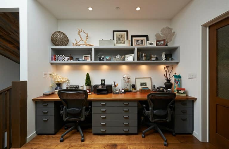
Best Office Paint Colours to Boost Productivity
Best Office Paint Colours To Boost Productivity
Nowadays, everything matters when it comes to giving the right impression to your clients in your office. Once they step up and come into your office, clients start judging you and your business. It doesn’t matter what your business is. Whether you manage a real-state, manufacture cars, or sell raw materials to big companies, you have to have a nice and elegant office. As we said, it will make a great impression on your clients.
You have to make them feel comfortable and relaxed in your office. How can you do it? Well, there are many ways to reach this result. Perhaps you want to greet them with a nice smile on your face or accompany them from the moment they enter your office until you say goodbye to them. Or, you might want to serve a nice cup of coffee with a delicious piece of cake to them.
What else can you do to ensure the clients will come back again and start doing business with you. Actually, another important aspect of your office is the colour. Yes! You heard right! Colour! But how? In fact, colours can significantly alter people's moods. It is an interesting task to select an appropriate colour for your office.
Every colour is associated with a specific emotion or feeling. Yes! Some colours evoke love. Some others remind you of the warmth of the summer or the coldness of the winter. Interestingly, these emotions can influence clients' choices! Colours might help them decide faster or choose your business to be worth dealing with instead of others.
So, are you interested in knowing about colours and their impact on your business? Have you started thinking about choosing a colour for your office but haven’t decided yet? If yes, you should read our article. First, we are going to show you how colours might affect people's decisions. For this, we need to know the psychology of colours. We will briefly talk about that. Then, we are going to introduce the best office paint colours to you to improve productivity.

What is Colour Psychology?
To put it simply, colour psychology is the study of the effects of colours on human behaviours. Believe it or not, colour psychology is one of the pillars of your success in the market. As we said earlier, colour can alter people's behaviours. Why do you think companies are so careful about the colour of their logos? Why do you think the colours of each of their flyers or posters have been chosen in a particular way?
It is because they can persuade people to buy more. Or, they might let clients trust a company earlier. More interestingly, sometimes, people need to be emotional to make the final decision. Some colours convey being emotional to buy something you wouldn't in a normal situation. Yes! All these issues show how colours are important to our business.

Psychology Of Colours
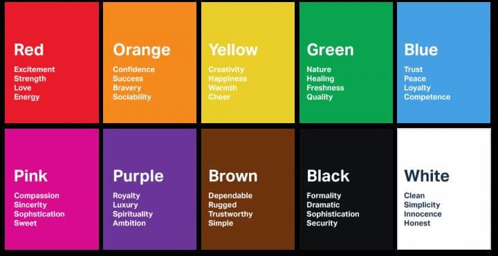
As we said, colours evoke emotions, right? Red, blue, orange, which one works for you the best? Well, it depends on the message you want to convey to people. Here, we are going to explain the emotions associated with colours.

Red Colour Psychology
Have you ever seen the coca-cola and YouTube logos? They are both in red, aren’t they? Usually, the colour red is associated with passion, danger, action, energy, and excitement. Encouraging people to make a move and decide faster about something come from the colour red. So, for example, if your office is supposed to sell products/services related to the food industry, red will be a big help.

Orange Colour Psychology
Let me emphasize this point. The environment you create in your office is not there just for the sake of your clients. In fact, in addition to creating a nice and calm atmosphere for them, you need to take care of your employees too. Every day, they spend nearly 8 hours in the office. So, the colour of walls, floors, and windows might be influential in their mood. Now, let's go back to the orange colour. Imagine that you are running an architect's office.
Your employees must come up with great ideas about how to design a building, right? So, you have to maximize the creativity of your employees. How? With orange colour. It is often associated with creativity, adventure, enthusiasm, success, and balance.
We said about the adventure, right? So, orange will be the best choice for you if your business is about tourism. When people come into the office to make a contract, they will be intrigued by the orange colour and sign it earlier.

Yellow Colour Psychology
The colour yellow is usually associated with happiness, positivity, and optimism. Let me explain how businesses use yellow to encourage people to come and make contact with them. For example, you have recently moved to a new area and want to buy furniture for your house. You don’t know the area very well, so you will start driving randomly.
Suddenly you see an office for buying and selling furniture in which the colour yellow is dominating. Since the colour yellow creates a sense of happiness in you, you are more likely to go to that store and probably buy whatever you want. You did this just because of the first feeling you had about that particular store. Yes, business is simple, but you should learn how to use colours effectively.

Pink Colour Psychology
Another useful colour is the colour pink. How can we use this colour? Just like other colours, you can use pink for your office. First of all, you should know that the colour pink represents femininity, playfulness, immaturity, and unconditional love. So, what colour should you use if most of your clients are females? For example, your office might belong to big beauty and fashion company. If you want to encourage female businesswomen, go for the colour pink and enchant their hearts! Or, with products related to women's private stuff like underwear, pink is a nice choice.

Green Colour Psychology
What about the colour green? How can we benefit from it? Again, it depends on your business. For example, if you are a multinational company selling healthy and natural products or building houses and building with the greatest attention to keeping nature safe and sound, the colour green is the best choice for you. This colour conveys feelings such as growth, fertility, health, and generosity. Clients will feel the right thing!
They will receive your company as an entity that cares about nature with the colour green in your office. It is not only good for your clients; it helps your employees to enjoy their working environment. However, be careful! Because the colour green is something associated with negative feelings such as envy.

Blue Colour Psychology
Stability, harmony, peace, calm, and trust are all your feelings from the colour blue. It reminds you of the sea or sky. It has a comforting power in it. The colour blue is the best choice for your clients to experience a very calm and relaxed environment. For example, you as a doctor can greatly benefit from this colour. How? Sometimes, you need to give bad news to people about their health conditions. With the colour blue everywhere in your office, they might get less upset and recover faster. Also, the colour blue is nice for doctors who give consultations to people.

Purple Colour Psychology
Power, nobility, luxury, wisdom, and spirituality are all the feelings conveyed by purple. So, it is one of the most multipurpose colours. So, this colour works very nicely in a real state office because it induces power in both parties. Also, if you are a religious person who gives religious doctrines to people who might like to decorate your office purple. But, be careful and don't use too much of it, since the negative feeling attached to the colour purple is frustration.
White Colour Psychology
You might not consider white a real colour, but it has a magical influence on everyone. You just need to go out and search for it. All the positive feelings such as innocence, goodness, cleanliness, and humility are related to white. It has been shown that the colour white is the most common colour in e-commerce websites. So, there must be something unique about it. It sometimes represents sterility and cold. So, don’t use it too much.
We can continue our list and talk about all those feelings coming up from colours. So, you might think that it is easy to choose a colour for your office, right? No, it isn't! First of all, no matter how positive emotions a colour evokes, using too much of it ruins everything. So, as a general rule, colours must be presented to the audience in a mixed way, so the effect of each of them isn't going to be so overwhelming.
That's where everything gets fuzzy because you really don’t know how much from each colour you need to use. But don’t worry, we will talk about how to use different colours in designing your office from now on. First, let see what is in the market? What combination of colour is suggested by different companies that design offices? Here are some of them.

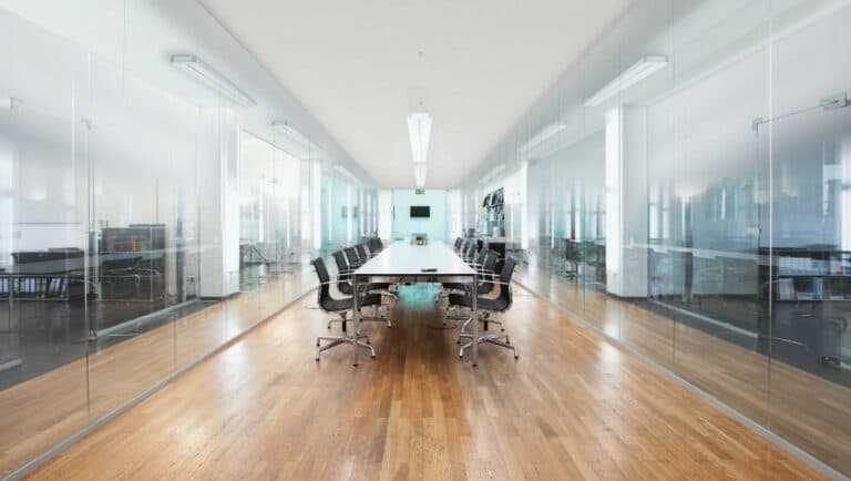
- The colour is close to white and has grey to black shadow as well.
- It is outstanding in preventing stress from coming into your office atmosphere.

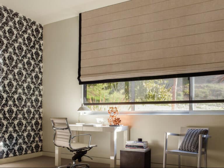
- This pattern is dark.
- So, it is perfect for places that people need to feel 100% comfortable.
- When you open an office where people receive therapy, medication, or medical consultant, this pattern works very well since it conveys that clients are in a very cozy place. So, they will open up themselves faster.

- This pattern represents peace because of the light green colour in it.
- It is a good choice when arguments are a normal part of the business.
- The pattern invites people to get calm and talk more peacefully.

- This pattern is nice when you are not looking for something radical. Pink is great but a bit bright! The same is true with white on the other side of the spectrum.
- However, this pattern has a mellowing effect that doesn’t make anybody uncomfortable.

- The pattern is a combination of blue and darker shades.
- Blue makes your office peaceful and comfortable.
- The darker shades bring some intelligence and strength into your office.
As you can see, you will create a unique atmosphere with the blue and darker shades.

- The colour is light gray.
- This is the best pattern if your office is located in your house.
- The pattern has a calming and peaceful effect.
- Also, it helps people get focused and concentrated.
Can you see? When you combine colours, you will get a better result. There is an endless number of patterns out there. However, not all of them are suitable for you. You need first to determine what emotions you are trying to increase in your office.

Is It Because Of Productivity Or Marketing?
Many people think that colours will bring us productivity, right? But is it all they can offer? Of course not. We might call it productivity, but we mean marketing, meaning to say that our business, logo, brand, and office must be memorable. When somebody comes in, they shouldn’t stop thinking about our business until they make the purchase. One of the most memorable things our business has is the logo. And, the logo is everywhere in your office.
So, choosing the correct colour for your logo must be considered a priority. From now on, I will share some of the secrets that big brands and companies use in their logo and other icons to receive more attention and eventually make more money. Yes, of course, we are talking about colours in the logos, but you can learn from it for your logo in your office and the office itself. Let's find out. In fact, you can learn from it for anything.
Red
- Many companies use the colour red in the logos as well as their offices' interior design.
- Some of the most famous companies are canon, coca-cola, Netflix, Xerox, adobe, virgin, and many more.
- Creating a sense of urgency is one of the most important goals behind using the colour red. For example, when red surrounds people, they will likely buy faster or make the decision quicker.
- Most companies related to the food industry have chosen the colour red in their office and logo because it stimulates the sense of being hungry.
- Sometimes, red is associated with anger, danger, warning, defiance, aggression, and pain. So, you should find a balance or mix it up with other less powerful colours.
- So you can use the colour red in your office if your business requires people to make a decision fast or they need to feel energetic.
Orange
- The colour orange is used in amazon, EasyJet, TNT, Mastercard, and firefox.
- These companies require their customers and employees to a lesser extent to feel confident, energetic, friendly, and innovative in the office.
- Too much use of it represents ignorance and immaturity.
- Men prefer the colour orange more than women. So, if your business is male-dominated, go for it.
Yellow
- Companies like CAT, BestBuy, BIC, Hertz, Post-it, Nikon, and DHL use yellow for their offices.
- It is always nice with a darker colour.
- It encourages people to be more optimistic and creative about the business they are working with.
- It sometimes represents irrationality, fear, and caution. So, try to blend it in with a darker colour to minimize the negative feeling associated with the colour.
- Again, men prefer the colour yellow more than women.
Magenta
- This colour is similar to purple with different lighting.
- Companies like Priceline, Victoria's secret, Bourjois, Id, and Donutlang are some of the company's whole designs dominated by the colour magenta.
- Women prefer it more than men.
- The colour represents passion, caring, and creative feelings.
- So, if your job is related to the abovementioned characteristics, you might want to mix another colour with the colour pink to increase productivity.
Again, we can continue the list of some of the most famous brands globally, but we have made our point, I guess. Many businesses have one prevailing colour for using in their logo, office, designs, etc. we know there is a fundamental reason behind using different colours in different advertisements.
How To Choose The Best Wall Paint Colour For Your Office?
So, we have learned about colours and their importance to our businesses. It is always nice to know the abovementioned issues and move forward wisely. Here are some more tips on how to make the best decision.
Think About The Purpose Of Your Space
Not all rooms in your office are going to have the same applicability. So, you have to choose based on what you want from them. For example, it is very nice to include tantalizing colours like red in the room you will make the contract or sell your products. Or, in the waiting areas, it is better to use more relaxing colours.
Check The Amount Of Natural Light In Your Space
Never ignore the impact of natural light on colours. For example, some rooms in your office might not receive natural light. So, it is suggested to use light colours for such spaces. Or, you can use darker tones when your room has enough natural light. So, as a general rule, keep your eyes on the impact of light on colours.
Consider Colour Impact
We have already talked about the psychological impact of colour on both employees as well as customers. Choose them so that they evoke relevant emotions in your target. For example, you definitely expect your employees to concentrate and avoid mistakes. So, go for blue and black as they are affiliated with supporting inner work. The same is true with all other colours.
The Size Of Your Space(s) Will Help Determine The Proper Colours
Let's talk about another general rule. When you have small rooms in your office, it is better to use lighter colours. Or, you might want to use darker colours if you have spacious rooms to create a more intimate atmosphere.
Conclusion
When people come to your office to make a purchase, everything does matter! From the coat and shoes you are wearing to environmental features in your office. One of the most important features of your office is the colour. As you know, colours are greatly associated with our feelings.
I mean, they can evoke kindness, excitement, sadness, and many other emotions. So, by knowing the psychology of the colours, you can use them in your office to alter customers' moods and emotional states and make them buy from your office.
We also said some other elements, such as the size of your rooms, the amount of natural light they receive, their applications, and many more. Combining these elements and choosing the right colour can significantly influence your sales by altering customers' behaviours. We talked about the psychology of colours and their impacts.
For example, red is associated with energy, attraction, and aggression, while black is closely related to sophistication and efficiency. We also introduced some commercial colours designed for specific purposes.
>>>Click here to read more about the psychology of colours on Wikipedia<<<
I trust you have enjoyed this article about the best office paint colours and find its content useful. Are you looking for more blog posts like this? Please stay tuned for new content to be added shortly. Take care.
JeannetteZ
Your Opinion Is Important To Me
I would love to hear from you. Please leave me your questions, experiences, remarks, and/or suggestions about the best office paint colours in the comments section below. You can also reach me by email at Jeannette@WorkFromAnywhereInTheWorld.com.
You might enjoy the following blog posts on setting up your home office:
How To Set Up Your Home Office – 10 Easy Design Ideas
27 Ways To Create A Stylish Small Home Office
Home Filing System – Made Easy And Organized
Or, you might be interested in how to make money from home:
How To Get Started With Affiliate Marketing
How Wealthy Affiliate Works – An Interesting Approach
Helpful Wealthy Affiliate Review – For Beginners By A Beginner
You might also want to check out my personal product recommendations.

