15 Best Colours For Your Home Office: A Complete Guide
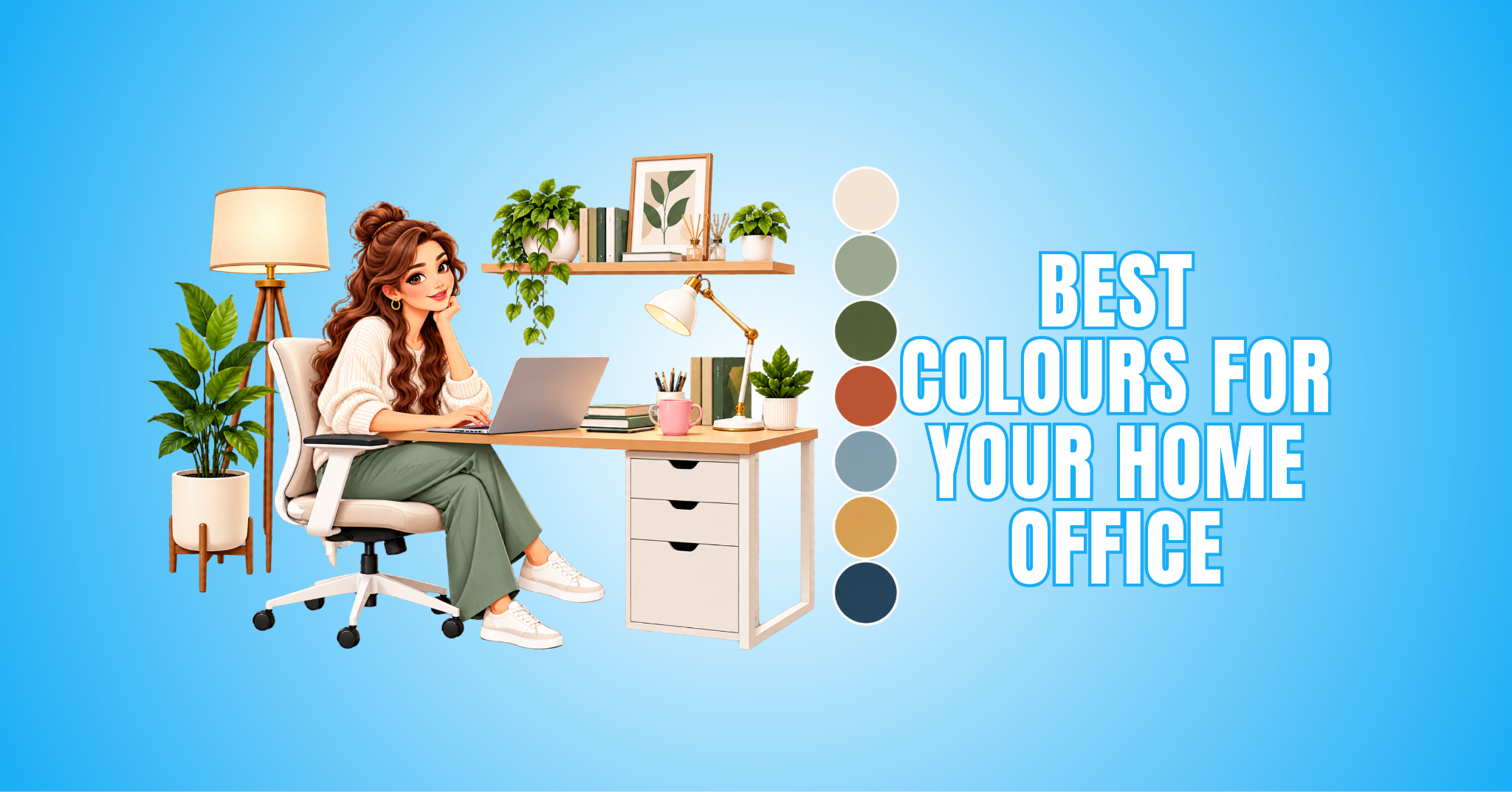
Choosing the best colours for your home office transforms an ordinary workspace into a focused, comfortable, and inviting space. The right colour shapes the room’s atmosphere.
Colour affects more than appearance. It can make a compact office feel more open, warm up a larger room, complement your furniture, and create a workspace that suits your daily routine.
Natural and artificial lighting change how a colour appears throughout the day. Room size, flooring, furniture, and surrounding décor also influence whether a particular shade works well in your space.
Soft blues and greens create a calm atmosphere, while warm neutrals and earthy tones bring warmth and character. Deeper colours add contrast and sophistication when they are used thoughtfully.
In this guide, we’ll explore the best colours for your home office and why each one is worth considering. You’ll also find practical ideas for choosing a colour that works with your space, lighting, furniture, and personal style.
Why Colour Matters In A Home Office
Colour is more than a decorative choice. It works with lighting, furniture, room size, and personal preference to shape your workspace’s overall character.
A carefully chosen colour can make a compact office feel more open or give a larger room a warmer, more inviting look. It creates an attractive backdrop for bookshelves, artwork, plants, and office furniture.
Lighting strongly influences how colours appear. Natural daylight can reveal different undertones, while lamps and overhead fixtures can make the same wall colour look warmer or cooler.
Your work habits and personal style matter, too. Someone who spends hours writing may prefer a calm, understated setting, while a creative professional might enjoy richer colours and stronger contrasts.
No single colour suits every home office. Consider your lighting, furniture, flooring, room size, and daily routine before choosing a shade that brings the entire workspace together.
15 Best Colours For Your Home Office
The best colours for your home office depend on more than personal preference. Lighting, room size, furniture, flooring, and the atmosphere you want to create all influence which shades work well together.
Some colours create a light, airy look, while others add warmth, depth, or contrast. Even subtle undertone differences can change how a colour looks once it is surrounded by your existing furnishings.
You do not have to limit the entire office to a single shade. You can pair a main wall colour with complementary trim, furniture, textiles, artwork, and decorative accents to create a more layered design.
The following 15 colours offer options for different office sizes, styles, and working environments. You can adapt each one with lighter or deeper shades to suit your space’s character.
1. Soft Blue For A Calm And Focused Atmosphere
Soft blue gives a home office a fresh, peaceful character while keeping the space visually refined. Its gentle, cool appearance works particularly well in rooms with plenty of natural light.
Pale blue pairs beautifully with white desks, light oak furniture, cream textiles, and natural materials. In a sunlit room, lighter shades can create an airy appearance that feels open and refreshing.
Deeper muted blues add more definition without becoming overly dramatic. This colour is ideal for anyone who prefers a peaceful, understated workspace with a clean, uncluttered look.
Blue walls can also provide an attractive backdrop for artwork, bookshelves, and greenery. Warm wood, subtle black accents, or brushed brass details add contrast and a more sophisticated finish.
Design Tips
- Pair soft blue with light wood, white, or cream for a bright, airy look.
- Add black or brushed brass accents for contrast and definition.
- Introduce greenery and natural materials to soften the cooler blue tones.
2. Sage Green For A Fresh Natural Feel
Sage green brings an elegant touch of nature into a home office without overwhelming the room. Its muted character works beautifully with wooden desks, woven baskets, indoor plants, and natural fabrics.
Pale sage can make a compact workspace feel light and refreshing. Richer shades add more depth and work particularly well in larger offices or as an accent wall.
This colour is ideal for anyone who enjoys nature-inspired or organic interiors. When a workspace already has plenty of greenery, sage walls can strengthen the natural theme while keeping the plants as an important part of the design.
Cream and warm white provide a soft contrast that keeps the overall palette balanced. The result is a polished, welcoming office with plenty of natural character.
Design Tips
- Pair sage green with oak, cream, or warm white for a natural palette.
- Add woven baskets, linen, or other natural textures for additional warmth.
- Use indoor plants to introduce different shades of green and create visual depth.
3. Warm White For A Bright, Timeless Office
Warm white creates a bright backdrop while bringing more softness than stark, pure white. Its subtle cream or beige undertones work particularly well with wooden furniture, neutral rugs, artwork, and decorative accessories.
This colour is ideal for minimalist offices, smaller rooms, and workspaces where you want plenty of decorating flexibility. Warm white provides a neutral foundation that can accommodate changing home office furniture, artwork, curtains, or accessories over time.
Lighting matters because it can change how the undertones appear. Natural daylight may make warm white look relatively neutral, while warmer artificial lighting can emphasize its cream or beige qualities.
Walnut furniture, black accents, textured fabrics, and warm metallic details provide contrast without overpowering the room. The finished space can feel clean, comfortable, and timeless rather than plain.
Design Tips
-
- Pair warm white with walnut, natural wood, or black accents for contrast.
- Add greenery, textured fabrics, and artwork to bring colour and personality to the neutral backdrop.
- Introduce warm metallic details such as brass or bronze for a more polished finish.
4. Beige For A Warm And Comfortable Workspace
Beige can turn a simple home office into a warm, welcoming space while maintaining an elegant appearance. Its neutral character works easily with cream textiles, wooden furniture, black details, woven accessories, and natural materials.
Beige with subtle grey undertones creates a more contemporary look, while warmer shades bring additional coziness. Layering beige with ivory, tan, and soft brown adds depth without making the room feel visually crowded.
This colour is ideal for traditional, modern, minimalist, and cozy interiors. It works particularly well when you want to design a home office that blends naturally with the surrounding rooms.
Thoughtful furniture, lighting, and decor choices keep a beige office from looking flat. Different textures and contrasting details can create a polished backdrop that remains comfortable throughout the day.
Design Tips
- Pair beige with cream, ivory, or soft brown for a warm, layered palette.
- Add medium-toned wood and woven materials to introduce natural texture.
- Use black or darker accents to provide contrast and definition.
5. Greige For Modern Sophistication
Greige combines the understated character of grey with the warmth of beige. It creates a versatile backdrop for contemporary home offices without leaning too strongly toward either cool or warm tones.
This colour works particularly well when plain grey feels too cool but traditional beige feels too warm. Greige walls pair beautifully with white shelving, natural oak furniture, matte black accents, and soft neutral textiles.
Greige is ideal for modern offices and sophisticated neutral interiors. Readers exploring similar shades can find more inspiration in our guide to office paint colours.
The appearance of greige can shift noticeably under different lighting conditions. Test a larger paint sample in your actual workspace and observe it at different times of day before choosing the final shade.
Design Tips
- Pair greige with white and natural oak for a clean, contemporary palette.
- Add matte black accents for definition and stronger visual contrast.
- Introduce soft textiles and natural materials to keep the neutral scheme warm and inviting.
6. Deep Navy For A Refined Statement
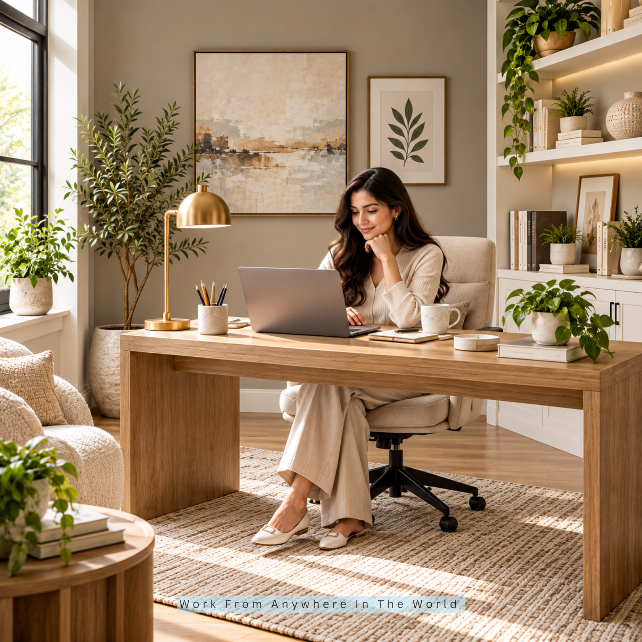
Deep navy creates a sophisticated focal point while adding considerable visual depth. It works particularly well behind a desk, where the darker backdrop can frame artwork, shelving, and furniture beautifully.
Warm wood tones such as walnut provide an appealing contrast. Brass or gold-toned details add warmth and give the deeper colour a polished, elegant finish.
Deep navy is ideal for executive-style offices, study rooms, and sophisticated interiors. When painting the entire room feels too intense, a single feature wall can introduce the colour with greater flexibility.
Because navy absorbs more light than paler shades, thoughtful illumination becomes particularly important. Combining natural light with home office lighting ideas can keep the room balanced while preserving the dramatic character of the darker walls.
Design Tips
- Pair deep navy with walnut or other warm woods for rich contrast.
- Add brass or gold-toned details to bring warmth to the darker palette.
- Balance navy with lighter neutrals on surrounding walls, ceilings, or furnishings.
7. Terracotta For Creative Energy
Terracotta introduces earthy warmth and expressive character into a home office. Its reddish-orange undertones create a distinctive backdrop that works particularly well with natural materials and softer neutral shades.
Natural wood furniture, cream textiles, woven accessories, and indoor greenery complement terracotta beautifully. A muted shade provides warmth without becoming overly dominant and is generally easier to coordinate with other colours.
Terracotta is ideal for designers, artists, content creators, and anyone who prefers a workspace with more personality. A feature wall behind the desk creates a strong focal point without requiring the colour throughout the entire room.
Artwork, cushions, storage baskets, and accessories can carry smaller touches of terracotta through the space. Choosing the right home office desk can provide a natural foundation for these decorative elements while keeping the working area practical.
Design Tips
- Pair terracotta with cream, ivory, or warm white to soften its richer tones.
- Add natural wood, woven materials, and greenery for an earthy, layered appearance.
- Repeat terracotta through artwork or accessories when you prefer not to use it on every wall.
Wealthy Affiliate – Mini Review
If you’ve ever thought about turning your blog, passion, or niche into an online business,
Wealthy Affiliate (WA) is one of the most beginner-friendly platforms I’ve used.
It combines step-by-step training, website hosting, AI-powered tools,
keyword research, and an active community all in one place.
What I like most is that you can start for free (no credit card needed), explore the platform,
test the tools, and connect with other entrepreneurs before upgrading.
WA isn’t a “get rich quick” scheme — success comes from consistent effort
and applying what you learn over time.
8. Light Grey For A Clean Contemporary Look
Light grey provides a sophisticated neutral backdrop that adapts easily to many home office styles. Its understated appearance gives artwork, plants, shelving, and decorative objects plenty of room to stand out.
Warm or balanced greys work particularly well with natural materials that soften the palette. A wooden desk, textured rug, woven basket, or warm-toned lamp creates appealing contrast against grey walls.
Light grey is ideal for contemporary offices, minimalist interiors, and small home office designs. Its neutral look offers plenty of flexibility when floor space is limited, making it especially practical for students creating a dedicated study and writing area.
In a well-lit office, soft grey can look particularly crisp during the day. Carefully chosen furniture and accessories prevent the neutral palette from feeling flat or overly cool.
Design Tips
- Pair light grey with oak, soft white, or other warm neutrals for a balanced palette.
- Add plants, woven materials, and textured fabrics to introduce warmth and visual interest.
- Use artwork or decorative accessories to bring stronger colours into the room without overwhelming the neutral backdrop.
9. Dusty Rose For A Soft, Elegant Office
Dusty rose offers a sophisticated way to introduce pink into a home office without making the space feel overly bright or playful. Its muted character brings warmth and personality while remaining easy to coordinate.
Cream, beige, walnut, white, and subtle metallic finishes pair beautifully with dusty rose. These combinations work across contemporary and traditional interiors without letting the pink tones dominate the room.
This colour is ideal for cozy offices, creative spaces, and soft contemporary interiors. A dusty rose wall can provide an elegant backdrop for neutral furniture, artwork, and shelving.
Smaller accessories can repeat the colour throughout the room for a more cohesive appearance. Warm natural materials and understated décor help balance the shade while maintaining its distinctive character.
Design Tips
- Pair dusty rose with cream, beige, or warm white for a soft, balanced palette.
- Add walnut or other warm woods to introduce richness and natural contrast.
- Use brass, bronze, or other subtle metallic details for an elegant finishing touch.
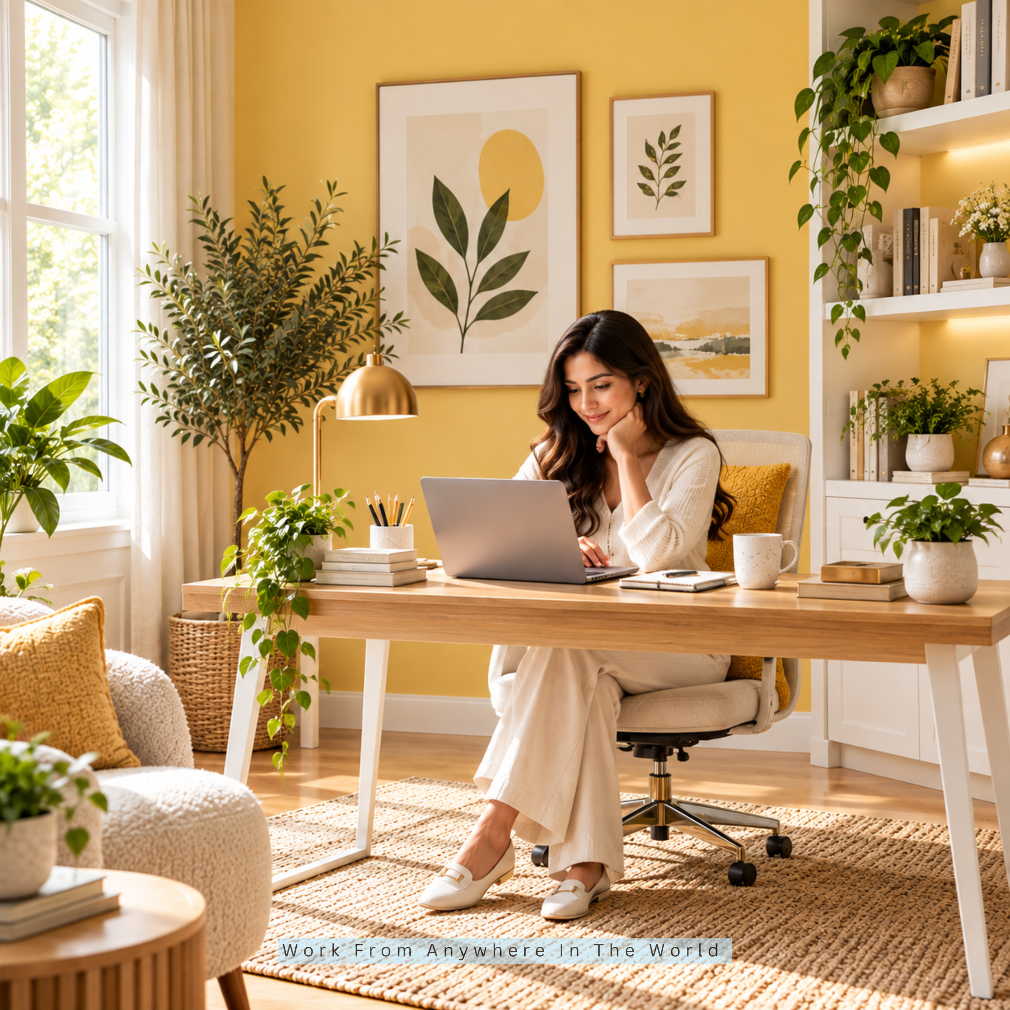
10. Muted Yellow For A Cheerful Workspace
Muted yellow introduces warmth and brightness while giving a home office a cheerful, welcoming character. Softer shades such as pale ochre, butter yellow, and muted golden tones create a more understated appearance than highly saturated yellows.
These shades work particularly well with white furniture, light wood, beige textiles, and indoor greenery. Neutral furnishings keep the overall palette balanced while allowing the warmer wall colour to stand out.
Muted yellow is ideal for creative rooms, compact offices, and interiors that benefit from a brighter visual atmosphere. In rooms with limited natural light, warmer yellow tones can make the surrounding space appear more inviting.
You don’t have to use yellow on every wall. Artwork, a desk lamp, curtains, cushions, or decorative accessories provide smaller ways to introduce the colour while maintaining a predominantly neutral backdrop.
Design Tips
- Pair muted yellow with white, cream, or beige to balance its warmer character.
- Add light wood and greenery for a fresh, natural combination.
- Introduce yellow through artwork or accessories when you prefer a more restrained approach.
11. Charcoal For A Bold Modern Office
Charcoal creates a dramatic backdrop that gives a home office a distinctly contemporary character. Its deep neutral tone provides striking contrast against white shelving, lighter furniture, artwork, and warm wooden surfaces.
This colour works particularly well on the wall behind a desk, where it creates a strong focal point without requiring elaborate decoration. In a smaller office, using charcoal selectively can introduce depth while maintaining visual balance.
Charcoal is ideal for modern and industrial interiors or anyone who prefers a stronger, more dramatic workspace. Cream textiles, natural wood, and subtle metallic accents prevent the deeper shade from overwhelming the room.
Lighting becomes particularly important with dark walls because it helps balance the deeper colour. Choosing the right home office lighting can provide practical illumination while making the charcoal backdrop feel warmer and more inviting.
Design Tips
- Pair charcoal with warm wood and cream to soften the darker palette.
- Add white or light-coloured furniture for stronger visual contrast.
- Introduce subtle metallic accents to reinforce the modern appearance.
12. Pale Green For A Relaxed Workspace
Pale green offers a light, refreshing alternative to deeper green shades. Its gentle appearance adds colour without making it the room’s dominant feature.
White furniture, pale wood, bamboo accessories, woven textures, and indoor plants complement pale green beautifully. These natural elements reinforce the fresh appearance while adding texture and visual interest.
This colour is ideal for smaller offices, natural interiors, and relaxed workspaces. Adding stress-relieving plants for offices can extend the natural theme while introducing different shades, shapes, and textures.
Pale green also works well when the office connects visually with surrounding living spaces. Warm white, cream, or light beige provide subtle contrast and help create a polished, cohesive interior.
Design Tips
- Pair pale green with warm white, cream, or light beige for a soft palette.
- Add bamboo, pale wood, and woven textures to reinforce the natural character.
- Introduce plants with different leaf shapes and shades of green for additional depth.
13. Cream For A Cozy And Elegant Look
Cream creates a warm, inviting foundation while retaining the brightness associated with lighter colours. It works particularly well with wooden desks, warm flooring, woven accessories, and traditional furniture.
Layering cream with ivory, beige, warm white, and soft tan creates subtle visual depth. These closely related shades keep the room interesting without introducing too many competing colours.
Cream is ideal for traditional, transitional, and cozy home offices. It also provides an attractive backdrop for artwork, bookshelves, plants, and decorative objects without demanding too much visual attention.
Walnut furniture adds richness, while thoughtful lighting brings out the colour’s warmer qualities. The result is a refined and comfortable workspace that can blend naturally with the surrounding home.
Design Tips
- Pair cream with walnut, beige, or soft tan for a warm, layered palette.
- Add woven materials and textured fabrics to create additional depth.
- Introduce greenery, artwork, or subtle metallic details for colour and contrast.
14. Earthy Brown For A Rich, Grounded Interior
Earthy brown brings warmth, depth, and a classic study-room character to a home office. Medium brown tones feel particularly inviting when combined with cream, olive green, natural wood, and woven textures.
You do not need to cover every wall in deep brown to create this effect. Furniture, shelving, cabinetry, or a carefully chosen feature wall can introduce the colour without making the room feel too dark.
Earthy brown is ideal for libraries, study rooms, traditional offices, and warm interiors. Walnut desks and wooden bookcases reinforce the palette naturally while introducing different grains and textures.
Warm lighting complements the richer tones and creates a comfortable atmosphere for reading, writing, or computer work. Lighter walls, textiles, and accessories provide contrast so the finished room feels substantial without appearing heavy.
Design Tips
- Pair earthy brown with cream, ivory, or warm white to balance the deeper tones.
- Add olive green and natural materials for an earthy, coordinated palette.
- Mix different wood tones and textures instead of relying on one uniform brown.
For #15, I think we have a nice final opportunity for home office furniture—but we already used the furniture-brands pillar in #3. Instead, I would use one of our remaining design links only if it fits naturally. Looking at this copy, I actually prefer to leave the body link-free rather than weaken a good final entry.
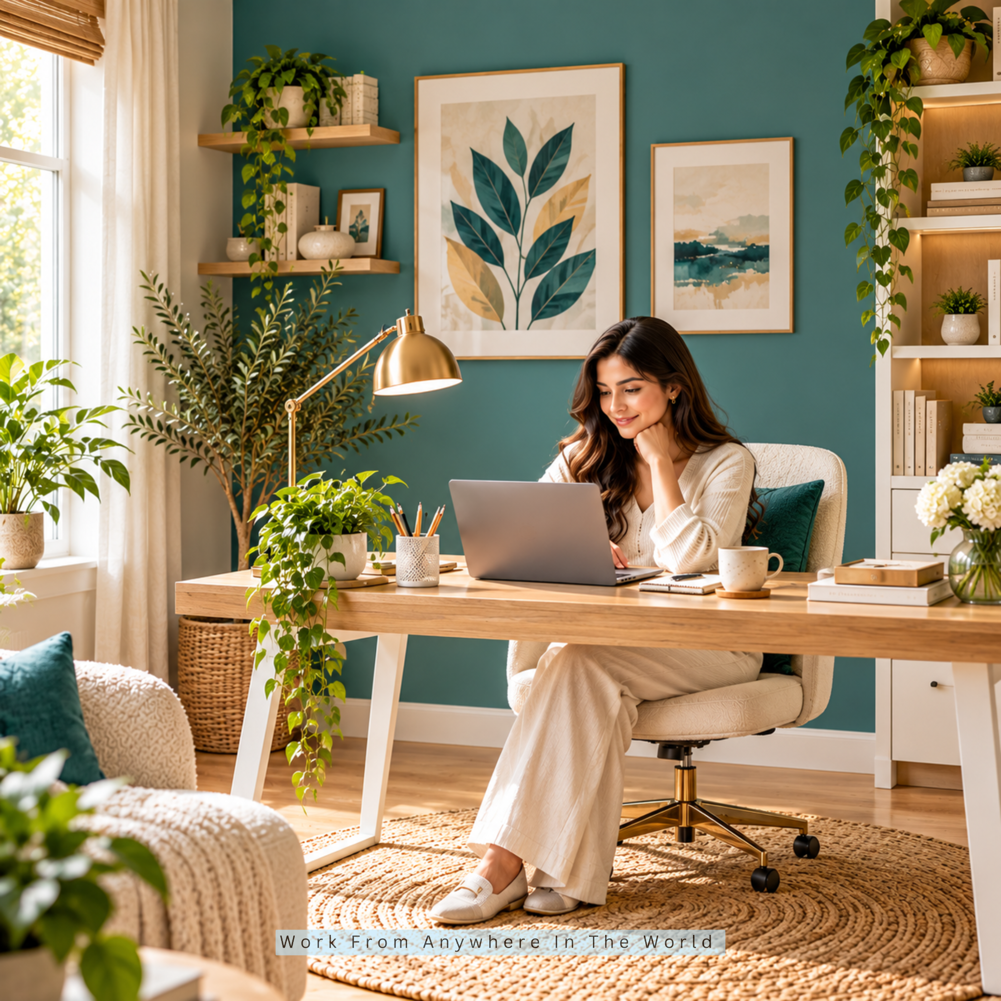
15. Muted Teal For A Stylish Creative Space
Muted teal combines blue and green to create a distinctive colour with plenty of personality. Its depth makes it particularly attractive in creative home offices where you want visual interest without making the room feel overly busy.
Light wood, warm white, cream, and understated metallic details pair beautifully with teal. These lighter elements provide contrast while allowing the richer wall colour to remain an important part of the design.
Muted teal suits creative professionals, content creators, and modern interiors. A feature wall behind the desk creates a strong focal point, while artwork, storage boxes, cushions, or desk accessories offer subtler ways to introduce the colour.
Because teal has noticeable visual depth, lighter furniture and accessories can prevent the room from feeling too enclosed. The result is a stylish workspace that feels creative, modern, and confidently individual.
Design Tips
- Pair muted teal with light wood, warm white, or cream for a balanced palette.
- Add brass or other understated metallic details for warmth and contrast.
- Introduce teal through artwork and accessories when you prefer a more flexible approach.
Frequently Asked Questions
Q1: What Colour Makes A Small Home Office Look Bigger?
Light shades such as warm white, pale blue, pale green, cream, and light beige can make a small home office appear brighter and more open. These softer colours reflect more light than deeper shades.
Good natural and artificial lighting can strengthen the effect. Lighter furniture, simple window treatments, and an uncluttered colour palette can make the entire workspace feel more spacious.
Q2: Is Green Good For A Home Office?
Green is a versatile choice for a home office, particularly softer shades such as sage and pale green. These colours pair naturally with wood, plants, cream, and other neutral tones.
Lighter greens create a fresh, understated backdrop, while deeper shades bring more richness and contrast. The right choice depends on your lighting, furniture, and preferred decorating style.
Q3: What Is The Best Neutral Colour For A Home Office?
Warm white, beige, greige, cream, and light grey are versatile neutral options. They provide an adaptable backdrop for furniture, artwork, plants, and decorative accessories.
Greige is particularly useful when you want something warmer than traditional grey but more understated than beige. Cream and warm white work well when you prefer a brighter appearance.
Q4: Should A Home Office Be A Bright Colour?
A home office does not need to be brightly coloured. Neutral and muted shades can create plenty of character while remaining easy to coordinate with furniture and décor.
Muted yellow, terracotta, teal, or dusty rose provide more colour without overwhelming the workspace. You can use them on the walls or introduce them through smaller decorative accents.
Q5: Should I Paint My Entire Home Office The Same Colour?
Using one colour throughout the room can create a cohesive look, but it’s not your only option. A feature wall can introduce a deeper or more expressive shade.
You can also bring colour into the office through furniture, artwork, curtains, rugs, shelving, and accessories. This approach makes it easier to change the colour scheme later.
Q6: How Do I Choose A Home Office Colour That Works With My Furniture?
Start with the largest existing elements, such as your desk, flooring, shelving, and office chair. Look for wall colours with undertones that complement those finishes.
Test paint samples beside your furniture before making your final choice. View them in both daylight and artificial light because the same colour can look noticeably different throughout the day.
Conclusion
The best colours for your home office are the shades that make your particular space feel comfortable, functional, and inviting. Soft blue creates a peaceful backdrop, while sage and pale green introduce a natural touch.
Deeper colours such as navy, charcoal, and earthy brown bring richness and sophistication. Warm neutrals such as cream, beige, greige, and warm white offer flexibility as your furniture and décor change over time.
Consider your room size, natural and artificial lighting, existing furniture, flooring, and personal style before making your final choice. These elements all influence how a colour looks once it is part of the complete room.
Most importantly, choose a palette that suits the way you use your home office and the atmosphere you want to create. A thoughtful colour scheme can turn an everyday workspace into a place you genuinely enjoy spending time in.
I trust you enjoyed this article on the 15 Best Colours for Your Home Office: A Complete Guide. Please stay tuned for more insightful blogs on affiliate marketing, online business, and working from anywhere in the world.
Take care!
— JeannetteZ 🌍✨
💬 Your Opinion Is Important To Me
Do you have thoughts, ideas, or questions? I’d love to hear from you. Please leave your comments below or email me directly at Jeannette@WorkFromAnywhereInTheWorld.com.
📚 More Work From Anywhere Reads
🚀 Ready to Build a Business You Can Run from Home
Or from Anywhere in the World?
Imagine creating income on your terms — from home, a cozy café, or wherever life takes you.
With the right tools, training, and community support, it’s entirely possible.
Start your own online business for free — no credit card needed.
Disclosure
This post may contain affiliate links. As an Amazon Associate and participant in other affiliate programs, I earn from qualifying purchases at no extra cost to you. Please read my full affiliate disclosure.