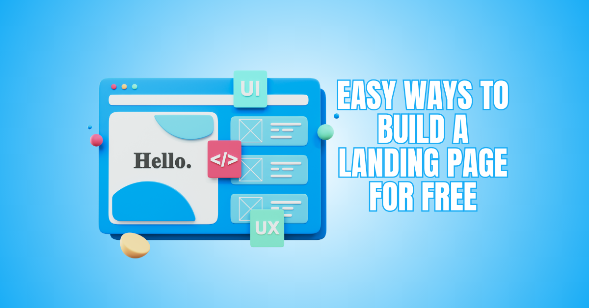
Easy Ways To Build A Landing Page For Free
Looking to build a landing page for free? You’re in the right place! Whether you’re starting a new business, promoting an offer, or growing your audience, a well-designed landing page can make all the difference.
The best part—it doesn’t have to cost a thing! This tutorial will teach you the easiest, most efficient ways to build a landing page for free and quickly get tangible results.
Steps To Build A Landing Page For Free
1. Define A Single Clear Goal
Start by writing one sentence that states the exact action you want visitors to take. Research similar offers and note their conversion goals. Use keyword tools to confirm search intent matches your goal.
Draft a primary headline and a single supporting sentence. Map the visitor path from arrival to conversion, removing distractions that don’t support the main action.
Create a simple wireframe that shows hero, benefits, proof, and CTA. Validate the goal with a quick poll of potential users or peers. If feedback shows confusion, refine the goal and repeat the test until it’s razor clear.
Pro Tips
- Ask five target users what they’d expect from the page.
- Limit CTAs to one main action.
- Use the user’s language found in reviews/forums.
- Save alternative goals for future A/B tests.
2. Choose The Best Free Builder
Compare free builders by features, limits, and integrations. Make a shortlist: Carrd, Mailchimp, HubSpot, Kit (ConvertKit), and similar tools. Research each tool’s hosting, SEO, analytics, form limits, and branding policies.
Build a quick test page for two candidates and measure setup time and ease. Check whether the builder supports SSL, custom domain (if needed), and analytics snippet insertion.
Read recent user reviews and changelogs to spot reliability issues. Consider how easy it will be to export or migrate content later. Pick the builder that balances speed, branding control, and the integrations you need for email or CRM.
Pro Tips
- Create a free account on two platforms before choosing.
- Check export options in settings.
- Verify form/lead limits on free plans.
- Look for community templates to speed design.
3. Research Your Audience
Audience research informs every choice. Start with keyword intent analysis to see what phrases your target uses. Survey potential customers, read forum threads, and mine social posts for language and pain points.
Build simple personas with motivations and objections. Run competitor analysis: note promises, pricing anchors, and proof types. Use analytics from similar pages you control, or test ads with tiny budgets to measure interest.
Record emotional triggers and common questions to answer on the page. This research becomes your messaging backbone and guides visuals, CTA wording, and trust elements for higher conversion.
Pro Tips
- Use free tools like AnswerThePublic for question insight.
- Read top reviews of competitor products.
- Create a short customer interview script.
- Save quotes for testimonial drafts.
4. Craft A Research-Backed Headline
Headlines must match user intent and offer clarity. Take your audience research and extract the most common benefit or pain. Draft three headline variations that state the promise, timeframe, or result.
Use A/B testing or a small social poll to pick the best performer. Ensure the headline includes your primary keyword naturally. Keep it short and scannable—people decide fast.
Pair it with a concise subheading that answers “how” or “why it works.” Validate by showing headline options to five prospects; if they nod or repeat the benefit, you’re on the right track.
Pro Tips
- Test both benefit-driven and curiosity-driven headlines.
- Keep headlines under 12 words if possible.
- Use numbers to increase specificity.
- Ensure the headline aligns with the ad copy if you advertise.
5. Build A Wireframe And Content Map
Sketch a skeletal layout showing hero, benefits, features, social proof, and CTA order. Map content blocks to the research insights—each block should answer a specific visitor question.
Plan forms and microcopy for error and success states. Decide image and video placements that reinforce your claims. Include analytics events for clicks and submissions.
Create a content checklist: H1, subhead, three benefit bullets, features, proof, FAQ, and CTA. Wireframes reduce redesign time and keep content focused. Share the wireframe with two colleagues or customers to catch gaps before you start building.
Pro Tips
- Use pen-and-paper or free wireframe tools like Figma templates.
- Label each block with its conversion purpose.
- Plan mobile-first sections.
- Include a fallback text-only version for speed.
6. Write A Compelling Call-to-Action (CTA)
Your CTA is the heartbeat of your landing page—it drives user action and conversions. Use strong, clear verbs like “Get Started,” “Join Free,” or “Download Now” to motivate visitors instantly.
Design your CTA button with high contrast colours that grab attention and ensure it’s visible at first glance. Keep your message consistent and make the button text goal-oriented.
When you build a landing page for free, a well-crafted CTA can still make it feel professional and trustworthy. A single click-worthy button can double engagement and turn curiosity into conversions.
Pro Tips
- Use contrasting button colours to make your CTA instantly visible.
- Keep the CTA text short, bold, and action-focused for clarity.
- Always place at least one CTA above the fold for immediate engagement.
- Repeat your CTA near the bottom to catch late decision-makers.

7. Tell Your Personal Story
A personal story connects deeply—it’s what makes your landing page memorable. Share why you created your offer or how it makes someone’s life better. Keep it short, honest, and focused on helping your audience.
People remember stories more than sales pitches, especially when they’re authentic. When you build a landing page for free, storytelling bridges the gap between you and your visitors.
Even a few sincere lines can make them feel emotionally invested. Let your purpose shine through and end with a hook that sparks connection and curiosity.
Pro Tips
- Keep your story under 100 words for maximum readability.
- Add a personal photo to humanize your message and boost trust.
- Focus on the problem-solution narrative to make your story relatable.
- End with an emotional or inspiring hook to deepen engagement.
8. Highlight Benefits, Not Features
Visitors want results, not technical jargon—so focus on what’s in it for them. Instead of saying “Includes templates,” say “Save hours with ready-made designs.” Benefits create emotional appeal and show how your offer improves lives.
Explain the transformation your product delivers rather than how it works. This approach keeps your free landing page feeling high-value and conversion-ready.
When users see the personal advantages clearly, they feel more confident to act. Make your message simple, outcome-driven, and centred on user success.
Pro Tips
- Use bullet points to highlight benefits clearly and attract attention.
- Focus each benefit on tangible results the user will experience.
- Add real-life success examples to make claims believable and relatable.
- Keep every sentence short, direct, and emotionally persuasive.
9. Implement Basic On-Page SEO
Add a focused title tag, meta description, and H1 that include your primary keyword naturally. Use descriptive URLs and structured data if the builder allows it. Add relevant sentences to file names and image alt text.
Keep content readable and avoid keyword stuffing. Add a brief FAQ section targeting long-tail queries found in research. Link to your main site or resources to increase trust and reduce bounce.
If the builder supports sitemaps, ensure your page is discoverable. Monitor search impressions and clicks in Google Search Console to refine title and description for higher CTR.
Pro Tips
- Use one primary keyword per page.
- Write a meta description that encourages clicks.
- Add alt text as descriptive sentences.
- Use canonical tags if duplicating content.
Wealthy Affiliate – Mini Review
If you’ve ever thought about turning your blog, passion, or niche into an online business,
Wealthy Affiliate (WA) is one of the most beginner-friendly platforms I’ve used.
It combines step-by-step training, website hosting, AI-powered tools,
keyword research, and an active community all in one place.
What I like most is that you can start free (no credit card needed), explore the platform,
test the tools, and connect with other entrepreneurs before upgrading.
WA isn’t a “get rich quick” scheme — success comes from consistent effort
and applying what you learn over time.
10. Select Visuals Using Research
Pick images that reflect your persona and use case. If research shows users value professionalism, choose clean, lifestyle photos; if they prefer relatability, use candid shots.
Create or source visuals that support the main benefit—screenshots for software, lifestyle imagery for services. Optimize image size for speed and include descriptive alt text using your keyword.
Consider short explainer videos if users in research prefer demonstrations. Use consistent colour tones and composition to build trust. Test whether people recognize the offer from the hero image within three seconds; if not, swap it for something clearer.
Pro Tips
- Use Unsplash/Pexels for free, royalty-free imagery.
- Export images at web-friendly sizes (under 200kb).
- Add descriptive alt text for accessibility.
- Create a quick GIF to show the product in action.
11. Create A High-Converting Form
Design a form with the fewest fields needed. Research shows fewer fields equal higher conversions. Ask only for essentials: email and a first name. Use inline labels, clear placeholders, and friendly error messages.
Offer a value sentence above the form that repeats the promise. Add privacy reassurance about how you’ll use the email. For deliverables, prepare an immediate thank-you message and a download email.
Track form submissions with analytics events and test form behaviour across devices. If you need qualifiers, use progressive profiling in follow-up emails rather than long initial forms.
Pro Tips
- Use hidden fields to track campaign source.
- Test both single-step and multi-step forms.
- Implement CAPTCHA sparingly to avoid friction.
- Send an instant confirmation email with clear next steps.
12. Strategically Use Social Proof
Place testimonials, logos, or numbers where visitors hesitate. Choose short quotes that reference specific outcomes. If you lack customers, use social counts, press mentions, or personal credentials.
Research which proves types boost trust for your niche: case studies for B2B, lifestyle photos for consumer offers. Add names, roles, and images when possible—specificity increases credibility.
Use micro-endorsements near CTAs and fuller case studies lower on the page. Keep proof authentic and refreshed; old or generic testimonials can backfire. Track conversions to see which proof variant performs best.
Pro Tips
- Ask customers for a short, outcome-focused quote.
- Use customer photos with permission.
- Rotate proof variants and test impact.
- Add a small date to older testimonials for transparency.

13. Optimize For Mobile
Most visitors now explore websites on their smartphones, so your landing page must shine on every screen size. Ensure your layout, text, buttons, and visuals are fully responsive and easy to navigate.
A mobile-friendly page loads faster, keeps users engaged, and prevents frustrating zooming or misclicks. Test how your design looks in portrait and landscape modes to maintain a seamless experience.
Even when you build a landing page for free, optimizing for mobile isn’t optional—it’s essential for conversion success. Smooth navigation and quick loading can make or break your first impression.
Pro Tips
- Make sure you thoroughly test your landing page across a range of screen sizes and mobile devices.
- Keep buttons large, bold, and easy to tap for effortless navigation.
- Shorten form fields to minimize typing and speed up conversions.
- Avoid horizontal scrolling completely to maintain a clean, user-friendly flow.
14. Optimize Page Speed And Performance
Fast pages retain visitors. Compress images, enable lazy loading, and minify CSS/JS where possible. Choose lightweight templates and avoid heavy third-party widgets that slow loads.
Use the builder’s built-in performance settings and test with PageSpeed Insights or similar tools. If the platform allows, enable CDN and image optimization. Remove unused fonts and reduce animation.
Keep the critical content above the fold minimal to load immediately. Run speed tests on mobile and desktop and prioritize fixes that improve first contentful paint and time to interactive. Faster pages equal better engagement and improved ranking.
Pro Tips
- Resize images to display dimensions before upload.
- Use WebP where supported.
- Limit external scripts to essentials.
- Monitor speed after each significant change.
15. Use Clear Navigation
Navigation should guide users, not confuse them. A cluttered menu can distract visitors from the main goal—taking action. Keep navigation minimal with just one or two essential links like “Home” and “Contact.”
This helps users stay focused on your offer without wandering off. When you build a landing page for free, simplicity makes your design look clean and professional.
Clear navigation also improves loading speed and mobile experience. By reducing friction, you help visitors reach your CTA faster, boosting engagement and conversions effortlessly.
Pro Tips
- Avoid full menus or dropdowns that pull users away from your primary focus.
- Add only essential links such as “Home” and “Contact” for easy guidance.
- Use anchor links to enable smooth scrolling to different page sections.
- Keep top bars sticky so visitors can navigate easily without losing their place.
16. Add An Exit Popup
An exit pop-up is a smart way to catch visitors just before they leave your page. It gives you one last chance to engage them—perhaps with a free resource, discount, or newsletter signup.
Even if you create a landing page for free, this tactic can assist in converting lost traffic into possible leads. Use eye-catching visuals and clear messaging to highlight the value you’re offering.
The key is subtlety—your popup should feel helpful, not pushy. Done right, it can boost retention, grow your email list, and increase overall conversions effortlessly.
Pro Tips
- Use only one well-timed pop-up to avoid overwhelming or annoying visitors.
- Always provide genuine value, such as a discount or free guide, not spam.
- Keep the pop-up copy short, persuasive, and action-driven for better results.
- Set the trigger to appear only when exit intent is detected for best timing.
17. Track Your Performance
Tracking your landing page performance is the secret to consistent growth. Connect Google Analytics or your platform’s built-in tracking tool to measure how visitors interact with your page.
Monitor clicks, time spent, bounce rates, and conversion percentages closely. These insights reveal what’s working and what needs improvement. When you build a landing page for free, data becomes your best optimization tool.
It helps you make more innovative design and content decisions that boost engagement. By testing and adjusting based on objective metrics, you can steadily increase conversions and overall performance.
Pro Tips
- Review your landing page statistics weekly to spot trends and patterns early.
- Track which CTAs and buttons perform best to focus your improvements.
- Use heatmaps if available to see where users click, scroll, or stop reading.
- Test different layouts and headlines regularly to find the highest-converting version.

FAQs
1. Can I Really Build A Landing Page For Free Without Coding?
Yes! Many no-code platforms let you build a landing page for free using drag-and-drop tools. Websites like Wix, Carrd, Mailchimp, and Kit (ConvertKit) offer free plans with beautiful templates. You can customize everything without touching a single line of code—perfect for beginners or small businesses.
2. What’s The Best Free Platform To Build A Landing Page?
The best platform depends on your goal. If you want easy email integrations, Mailchimp is great. For visual design flexibility, Wix and Carrd are perfect.
Systeme.io is ideal for marketers who need automation tools. All these let you build a landing page for free that looks professional and converts well.
3. Can I Use My Own Domain For A Free Landing Page?
Yes, some platforms let you connect your custom domain even on free plans, though others charge a small fee. If not, you can still publish under a subdomain. It’s a great start while learning how to build a landing page for free before upgrading later.
Conclusion
Now you can confidently build a landing page for free that delivers results and grows your audience. With the right tools and strategy, you can create professional pages without spending a dime.
Start designing today, test your layout, and watch your audience grow. Remember—success starts with the first click, and your free landing page can make that click truly count!
I trust you enjoyed this article on the Easy Way to Build A Landing Page for Free. Please stay tuned for more insightful blogs on affiliate marketing, online business, and working from anywhere in the world.
Take care!
— JeannetteZ
💬 Your Opinion Is Important To Me
Do you have thoughts, ideas, or questions? I’d love to hear from you. Please leave your comments below or email me directly at Jeannette@WorkFromAnywhereInTheWorld.com.
📚 More Work From Anywhere Reads
🚀 Ready to Build a Business You Can Run from Home
Or from Anywhere in the World?
Imagine creating income on your terms — from home, a cozy café, or wherever life takes you.
With the right tools, training, and community support, it’s entirely possible.
Start your own online business for free — no credit card needed.
Disclosure
This post may contain affiliate links. As an Amazon Associate and participant in other affiliate programs, I earn from qualifying purchases at no extra cost to you. Please read my full affiliate disclosure.